Client Overview:
Puro Gusto is an international café brand with a strong footprint outside the U.S. and a flagship location in Washington, DC. Unlike traditional grab-and-go coffee chains, Puro Gusto offers a refined, all-day café experience that blends specialty coffee, fresh food, and a robust cocktail selection, including its signature bottomless aperitivo. Rooted in global café culture, the brand emphasizes atmosphere, social connection, and elevated moments—making it a natural platform for immersive, seasonal campaigns.
Client Objective:
The goal was to create a series of seasonal campaigns for Puro Gusto that would allow them to stand out in the competitive restaurant market of downtown Washington D.C.
Campaign Highlight: Holiday 2023
Research and Initial Design Proposal
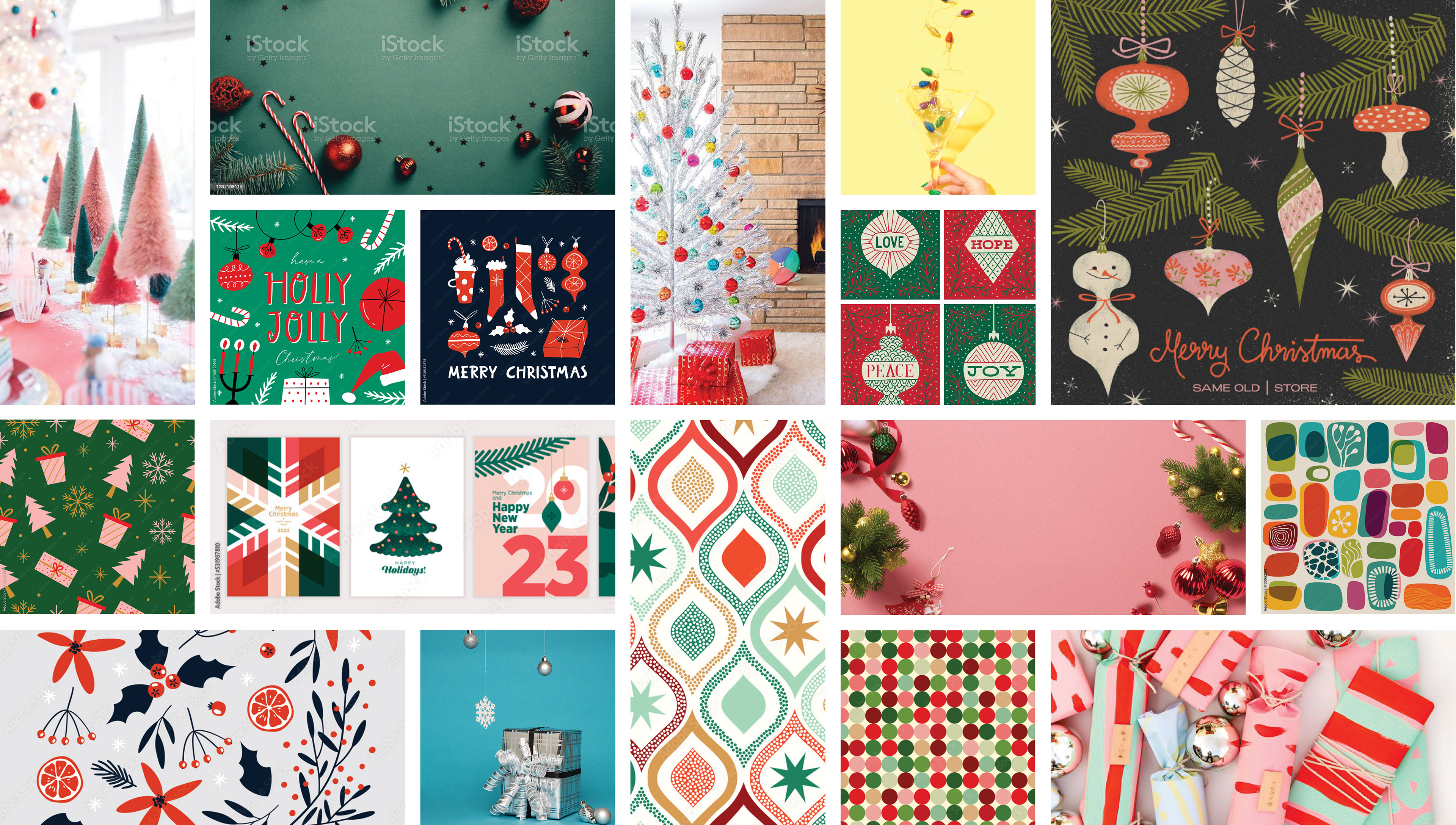
A mood board I created of colors, graphics, motifs and imagery I wanted to emulate during this campaign.
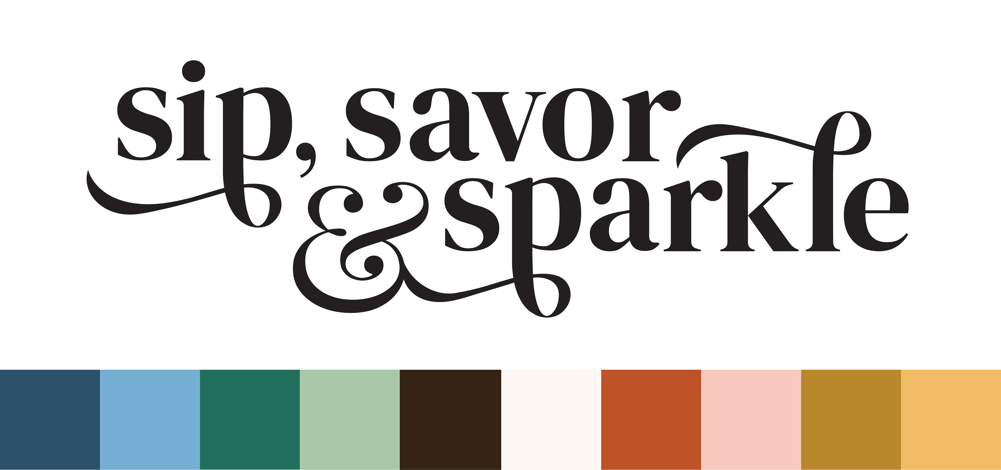
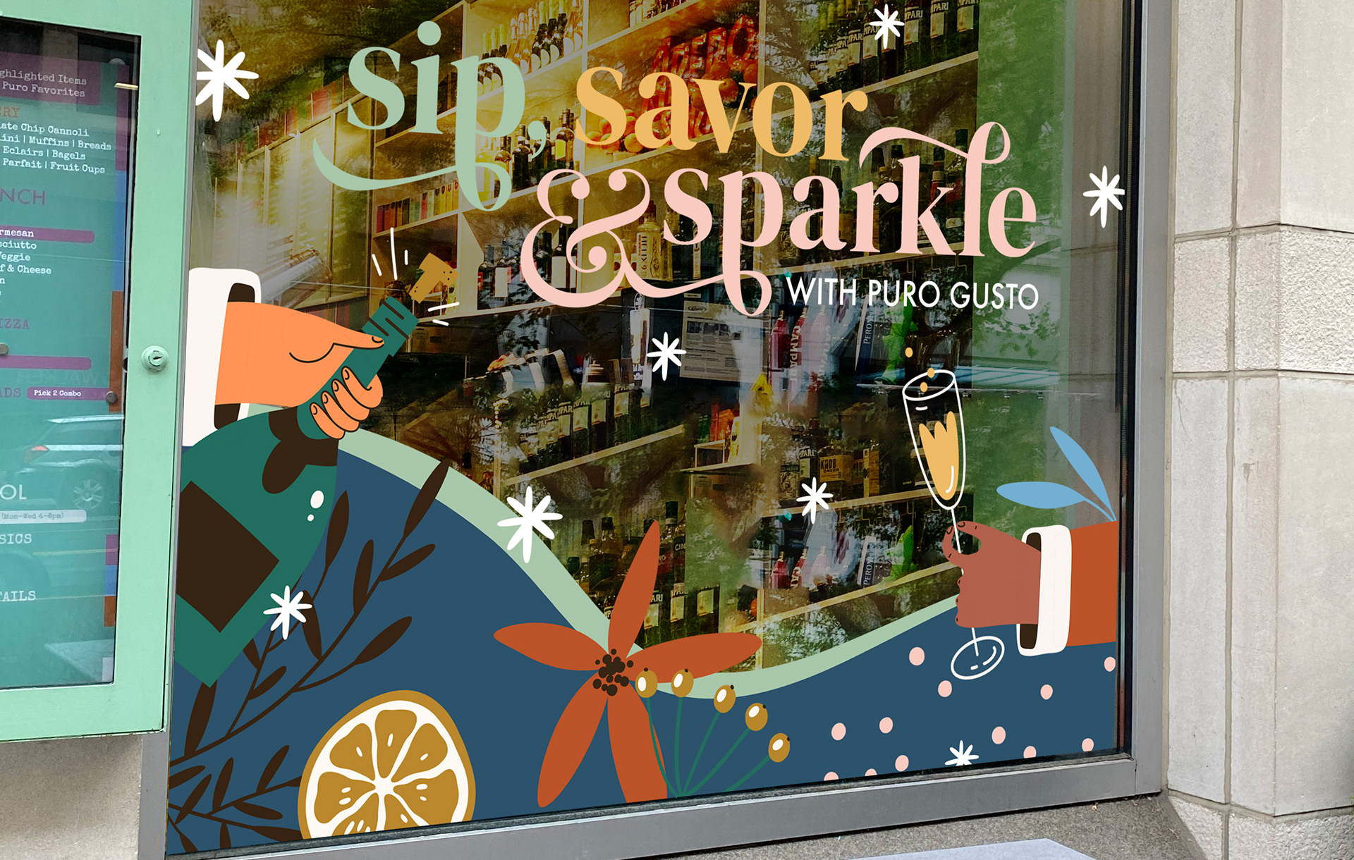
The slogan for the campaign that the design and social team brainstormed together.
This is the "Look and Feel" image featuring the slogan/logo, the color palette, and the graphic elements for the campaign.
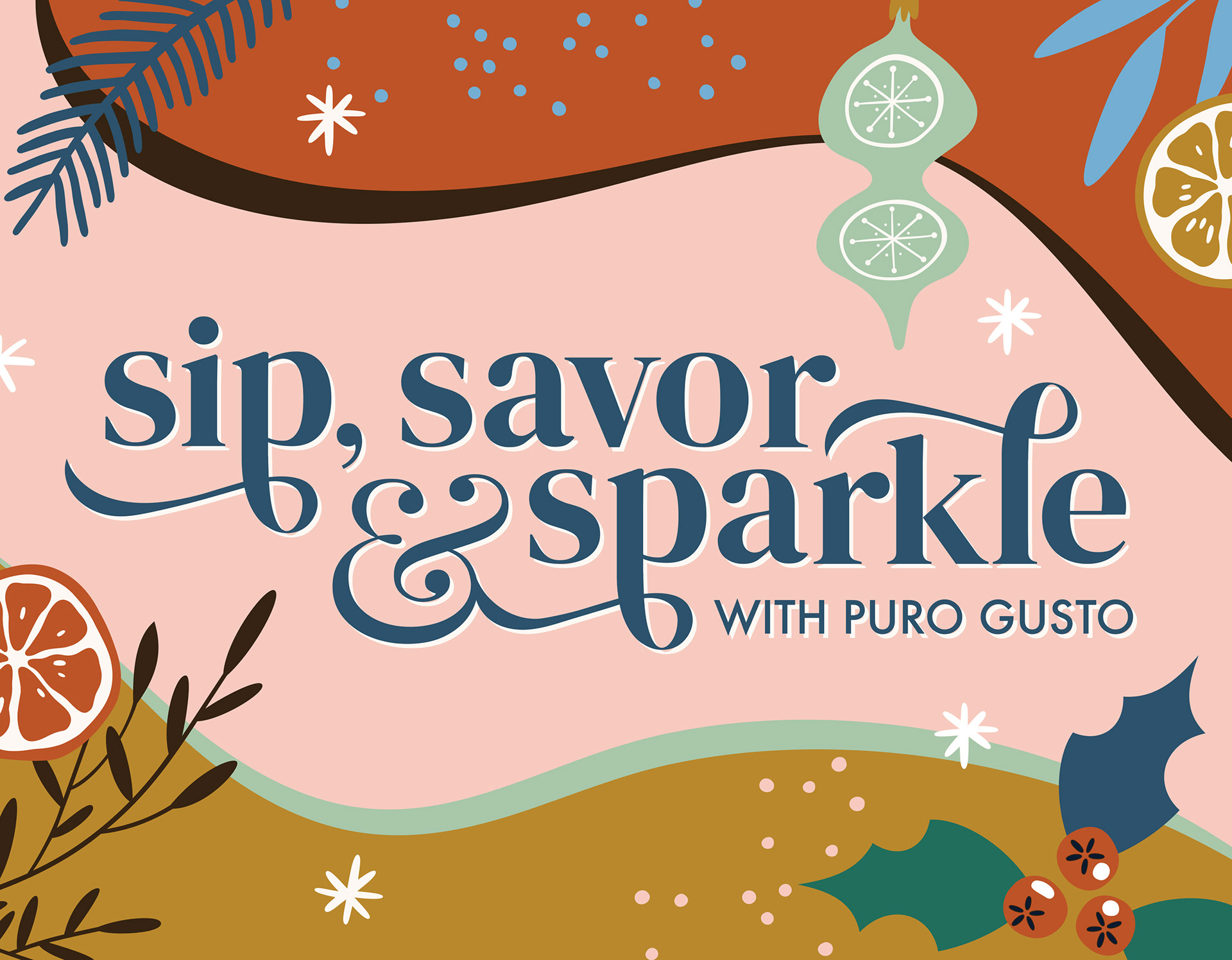
A sample social graphic showing the proposed style of the campaign.
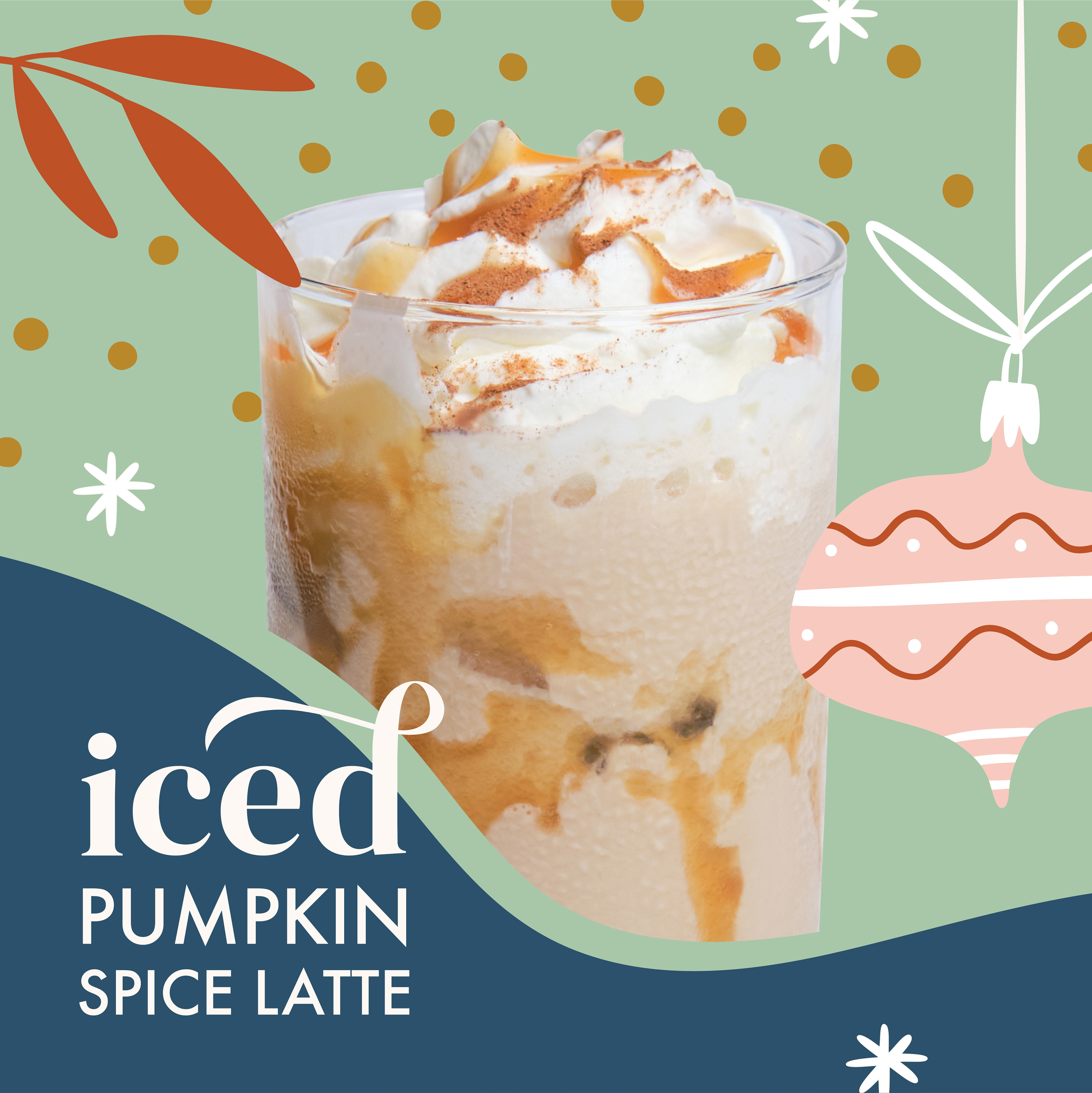
This is a slide from a pitch deck that was presented to the manager of Puro Gusto to review for the upcoming campaign.
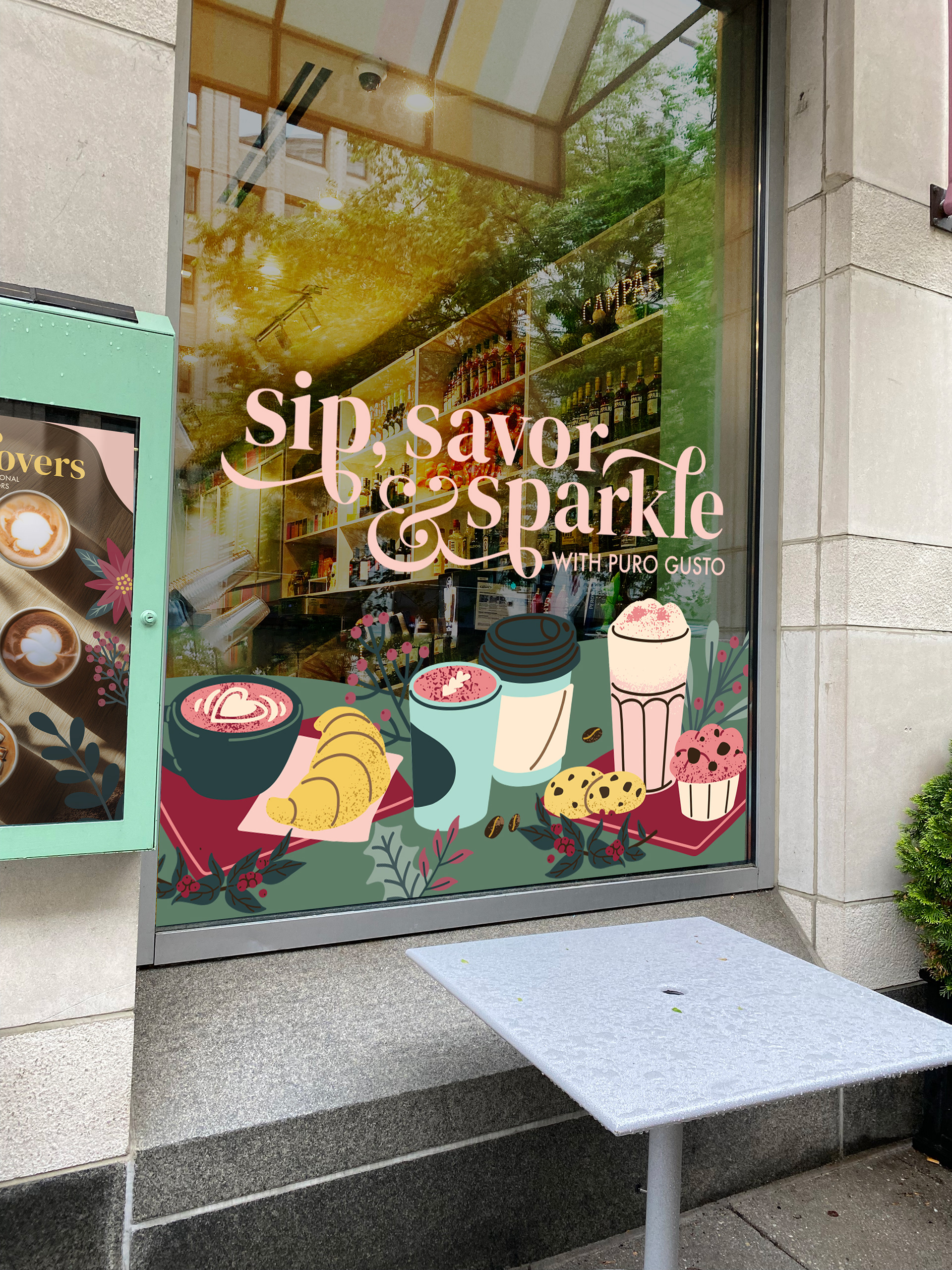
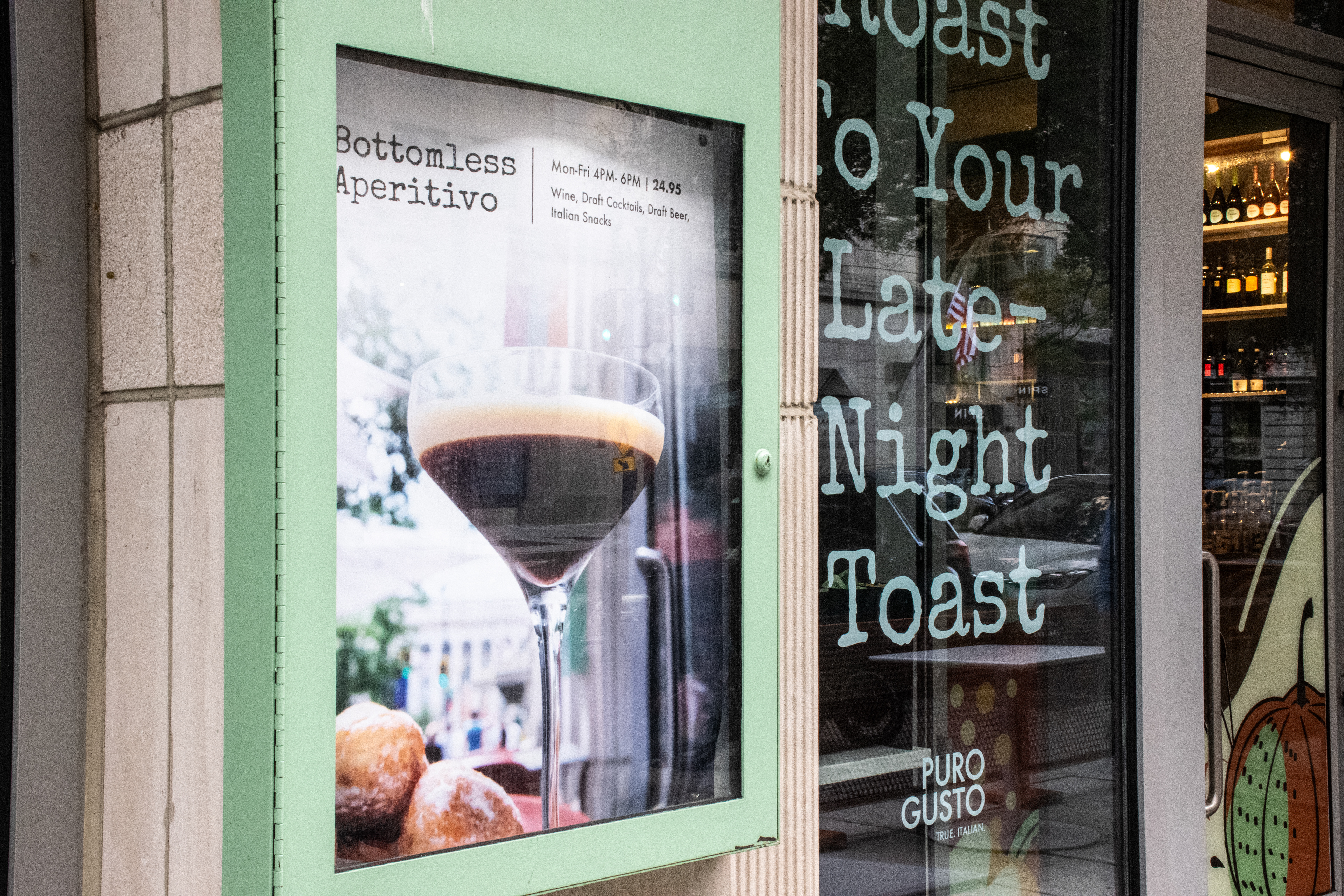
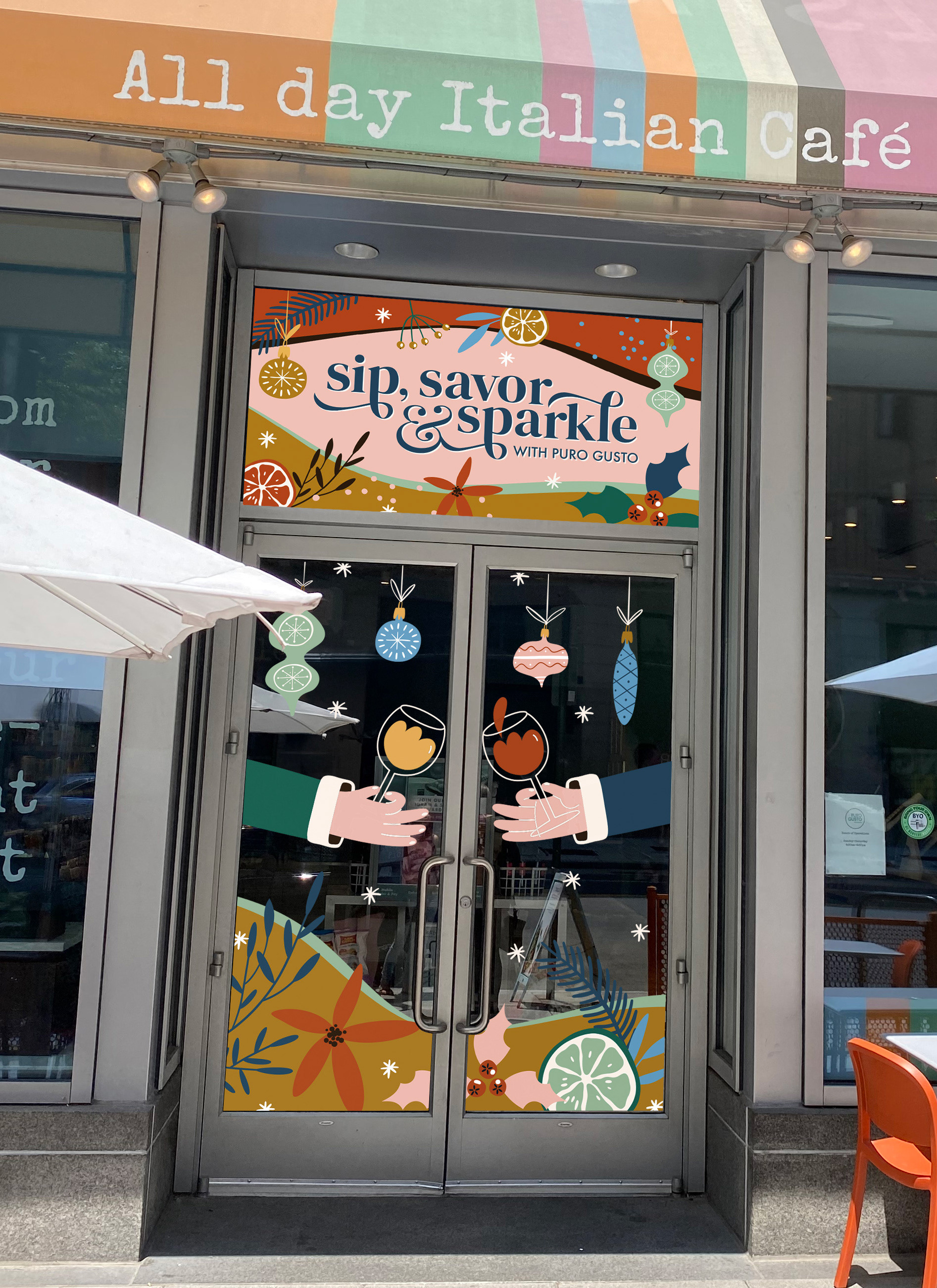
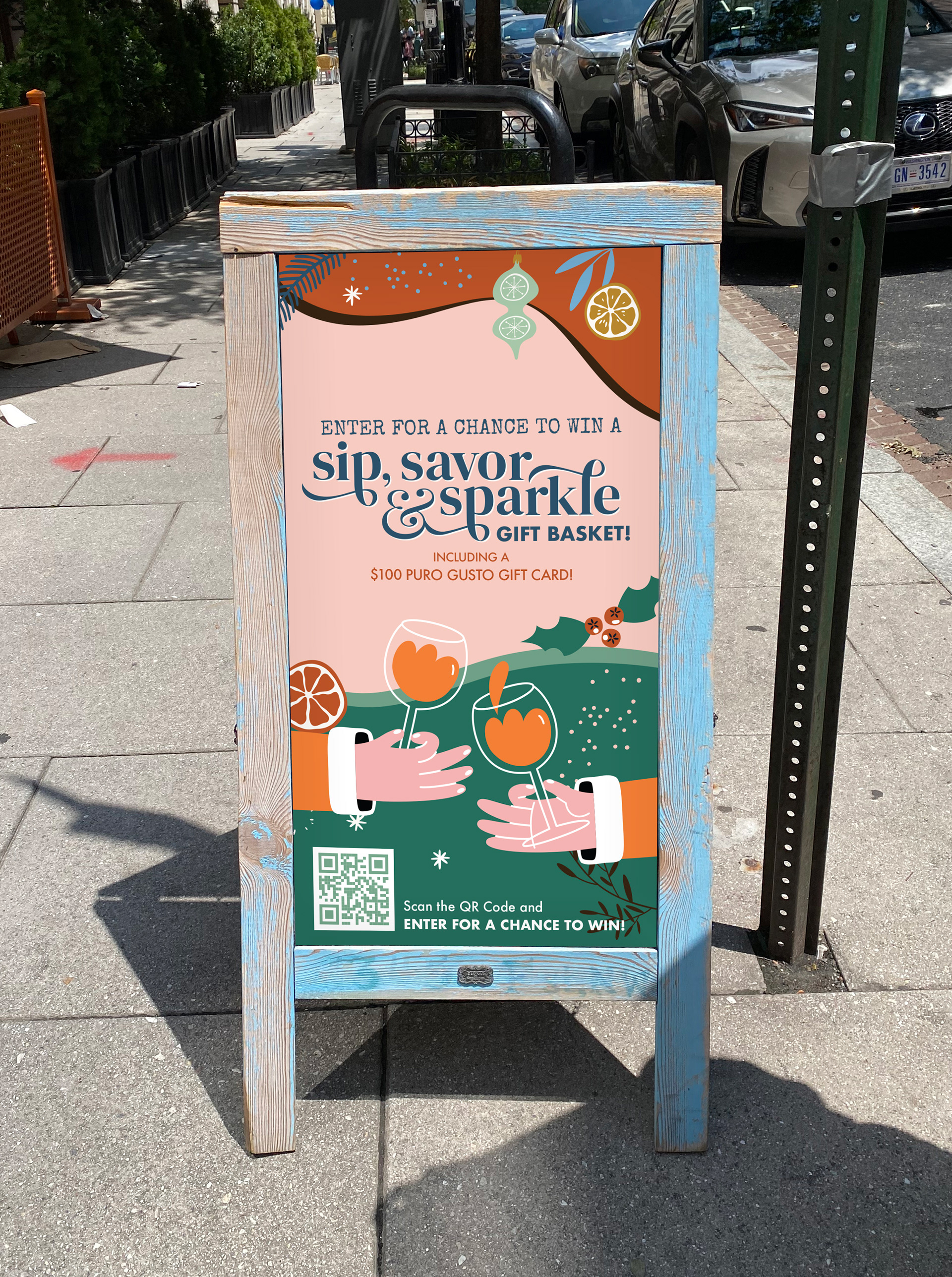
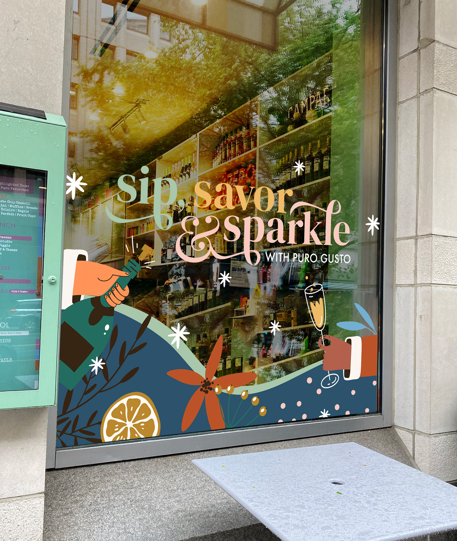
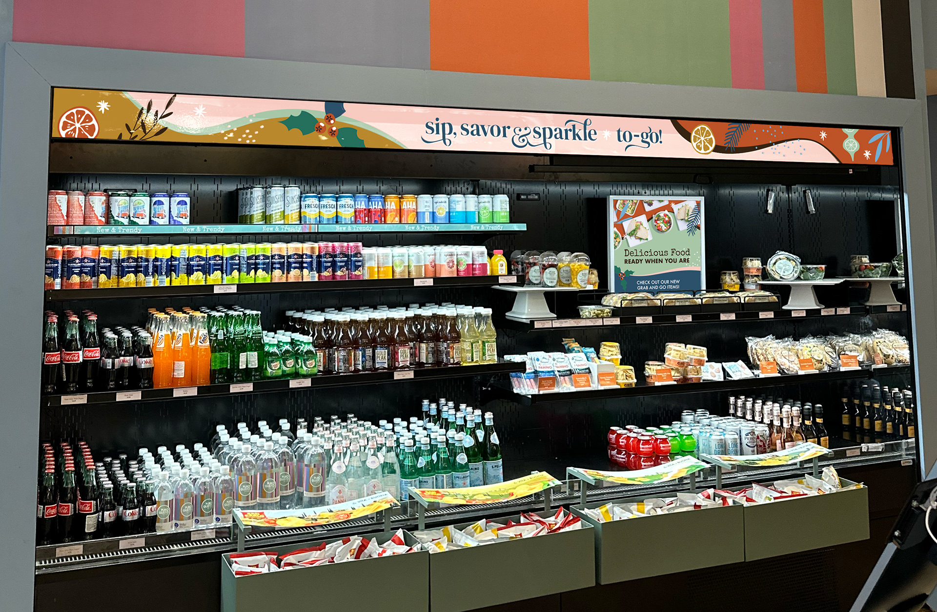
Our focus for this campaign was on coffee drinks and cocktails. We wanted to create a festive environment that people could go to after an office holiday party, or to grab coffee with a friend home for the holidays.
The visual direction for this holiday campaign was deliberately made to differentiate Puro Gusto from conventional seasonal branding used by other cafe chains. Rather than relying on widely recognized holiday tropes, such as traditional Christmas iconography or red-and-green color schemes popularized by mass-market coffee brands, the campaign aimed to establish a more joyful, festive, design-forward holiday experience.
Drawing from midcentury Christmas décor, the creative approach embraced a maximalist vibe defined by sparkle, saturated hues, and playful decoration. This direction aligned with broader cultural trends at the time, including the continued influence of the summer “Barbie” moment and a growing resurgence of midcentury modern and maximalist interiors. Incorporating pink as a primary color allowed the campaign to remain culturally relevant while also embracing the season rather than any one holiday.
The use of pink and teal (intentionally nontraditional holiday colors) reinforced the midcentury inspiration while creating a fresh visual cohesion with Puro Gusto’s existing brand palette. The result was a seasonal identity that felt festive yet unexpected, positioning Puro Gusto as a destination for elevated, experiential café culture rather than a traditional grab-and-go coffee brand.
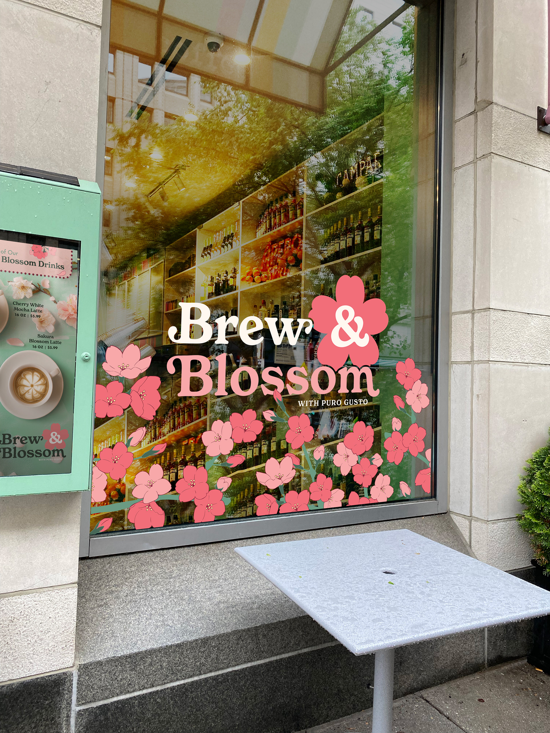
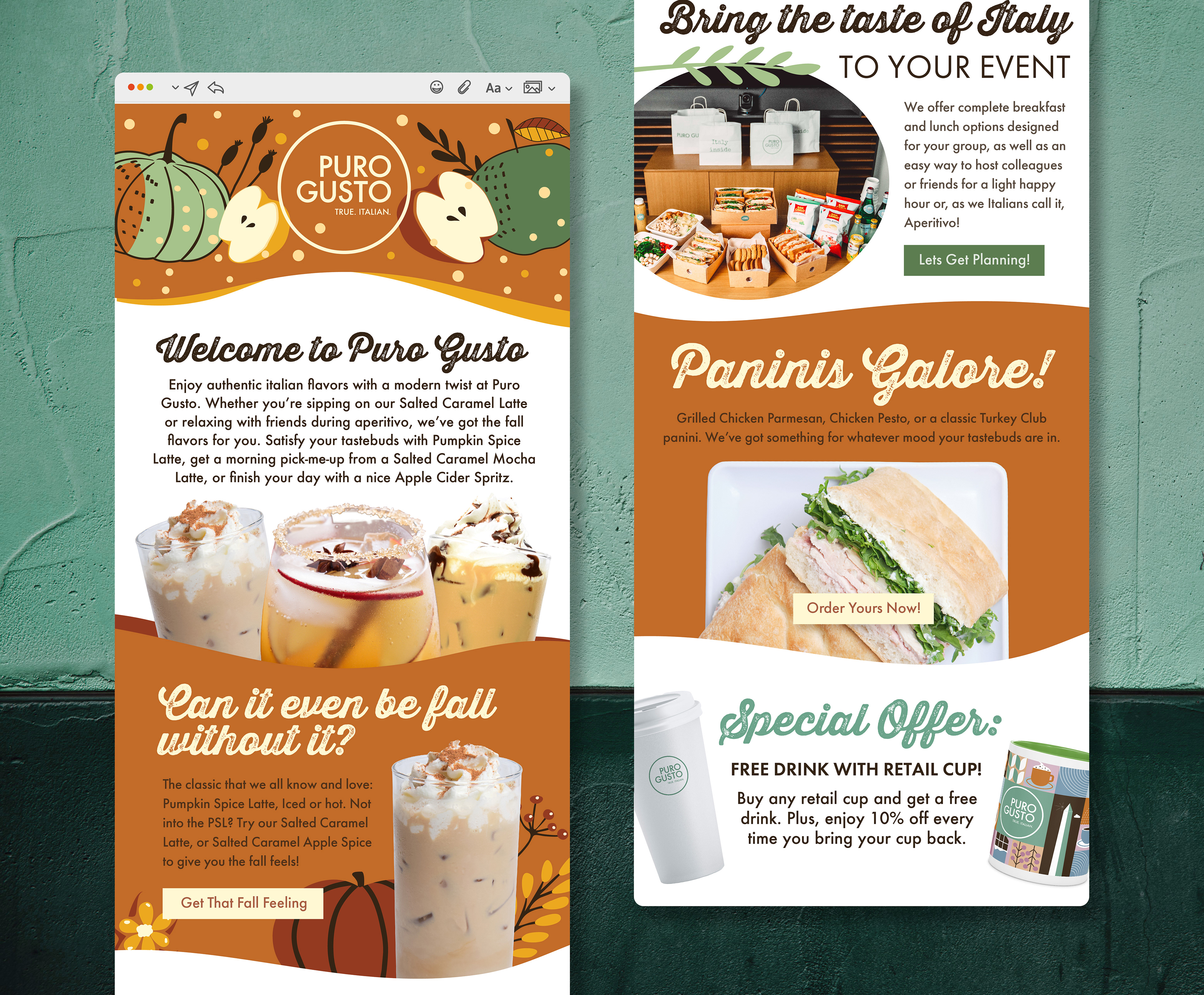
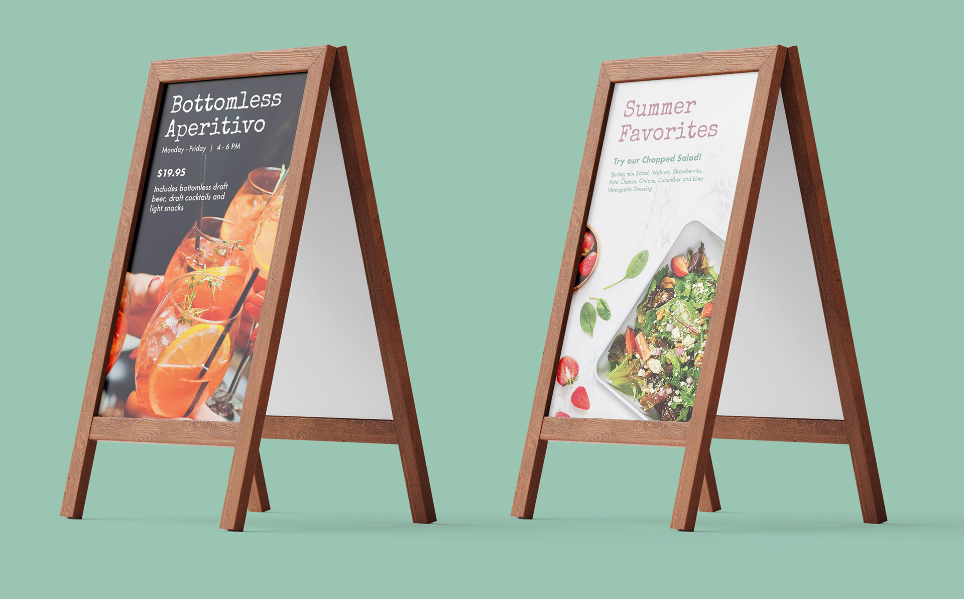
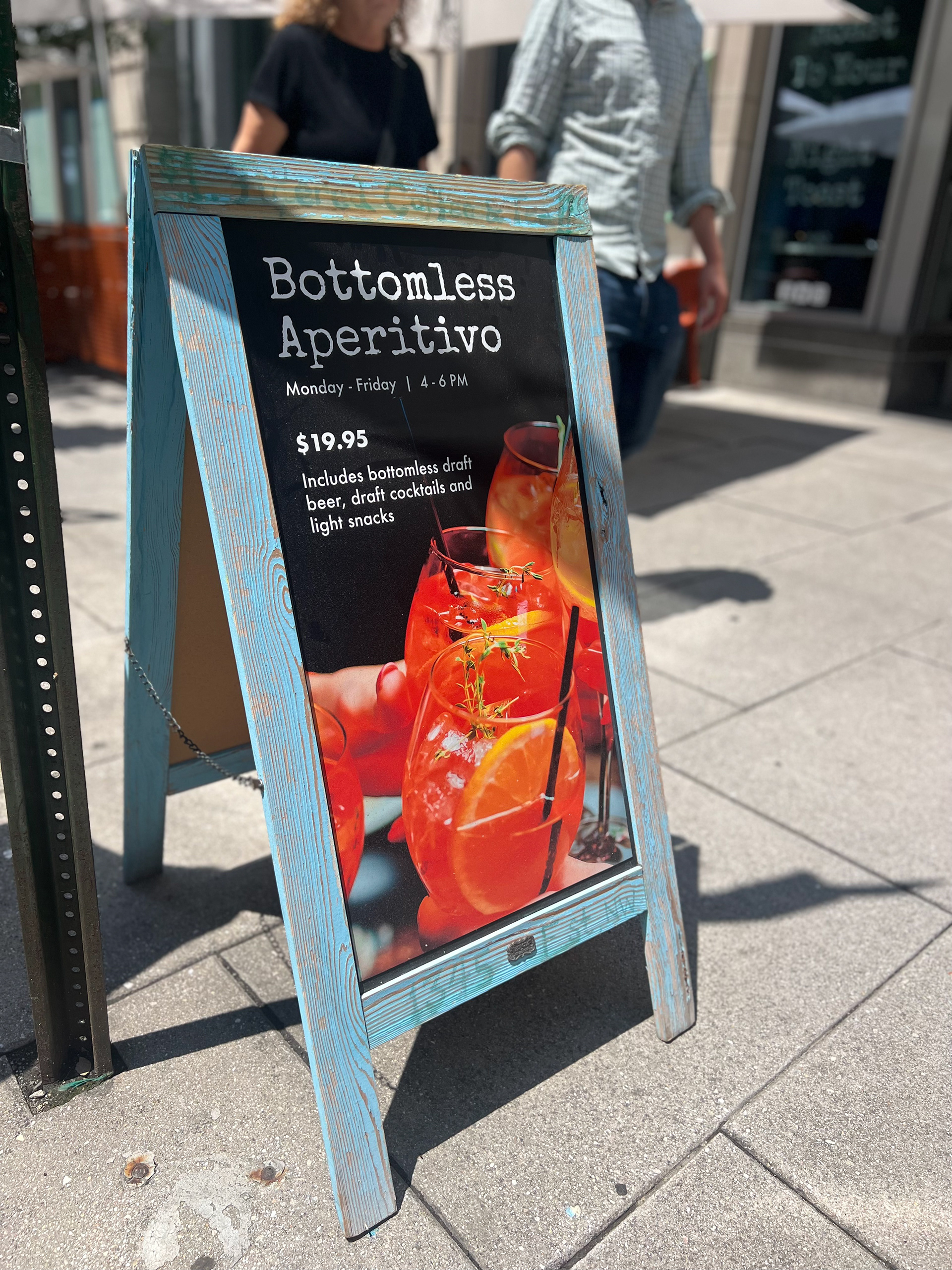
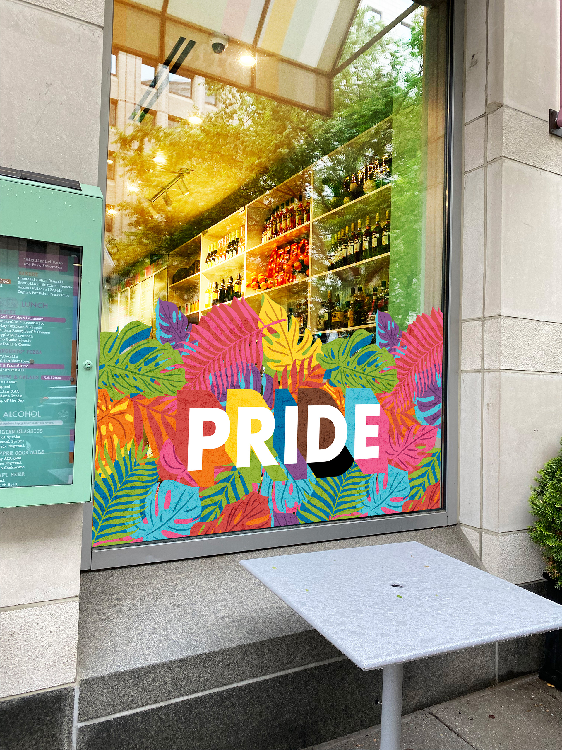
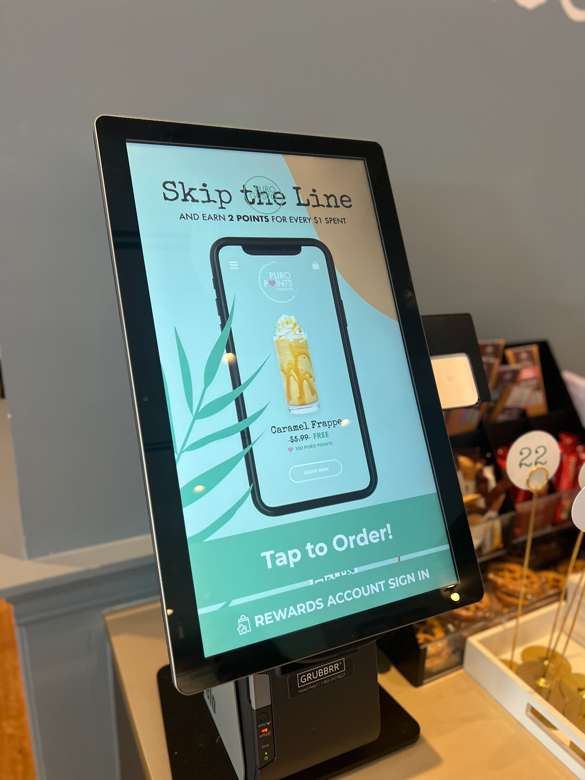
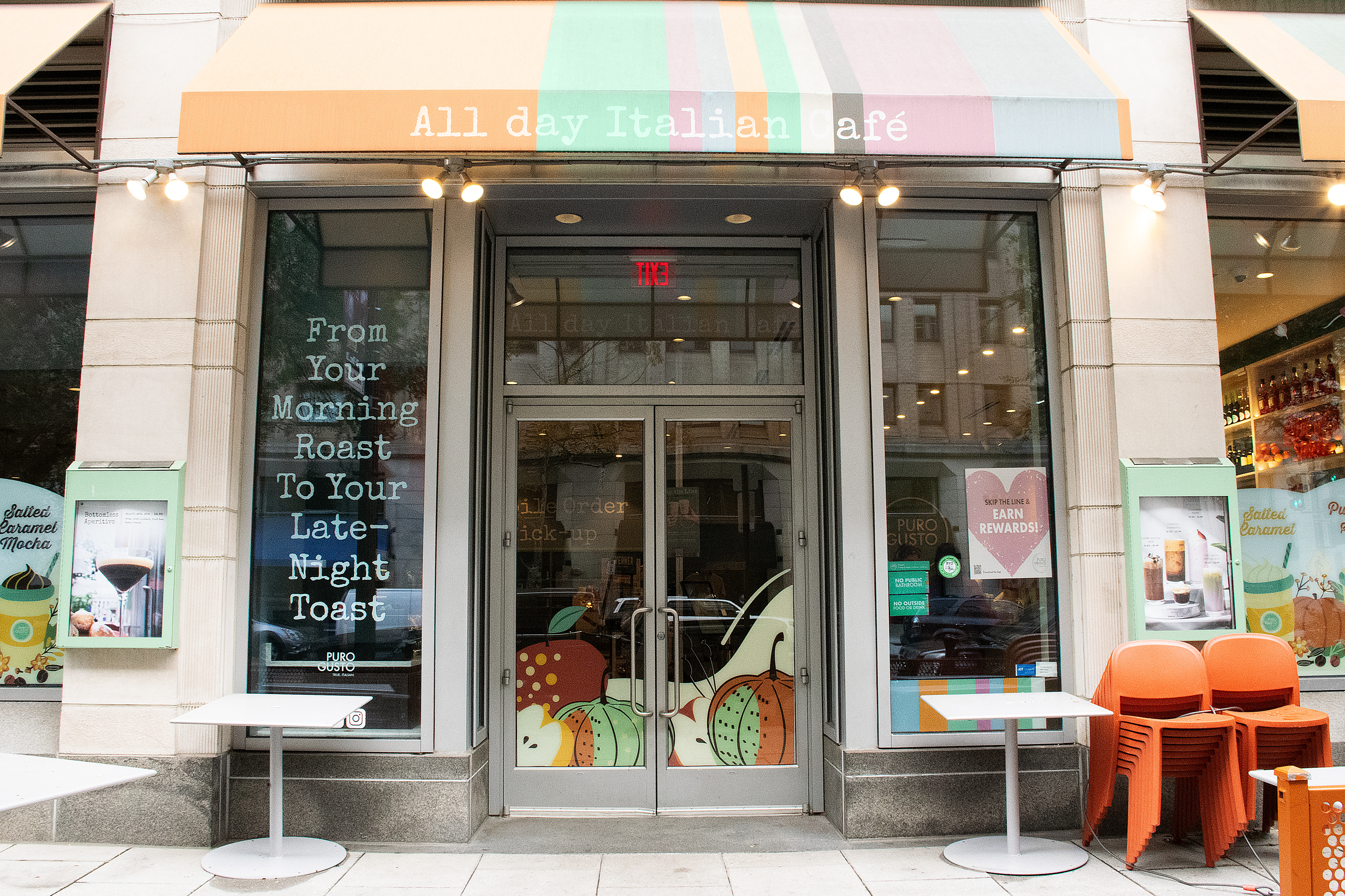
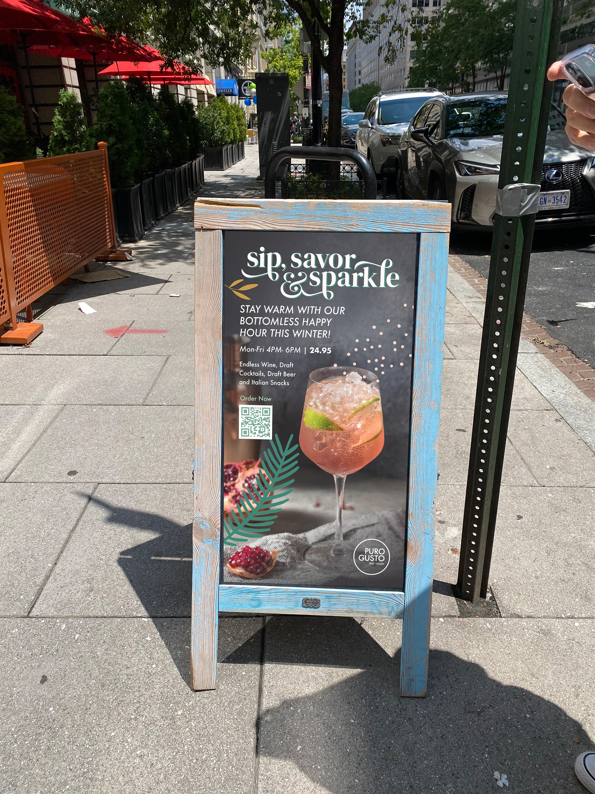
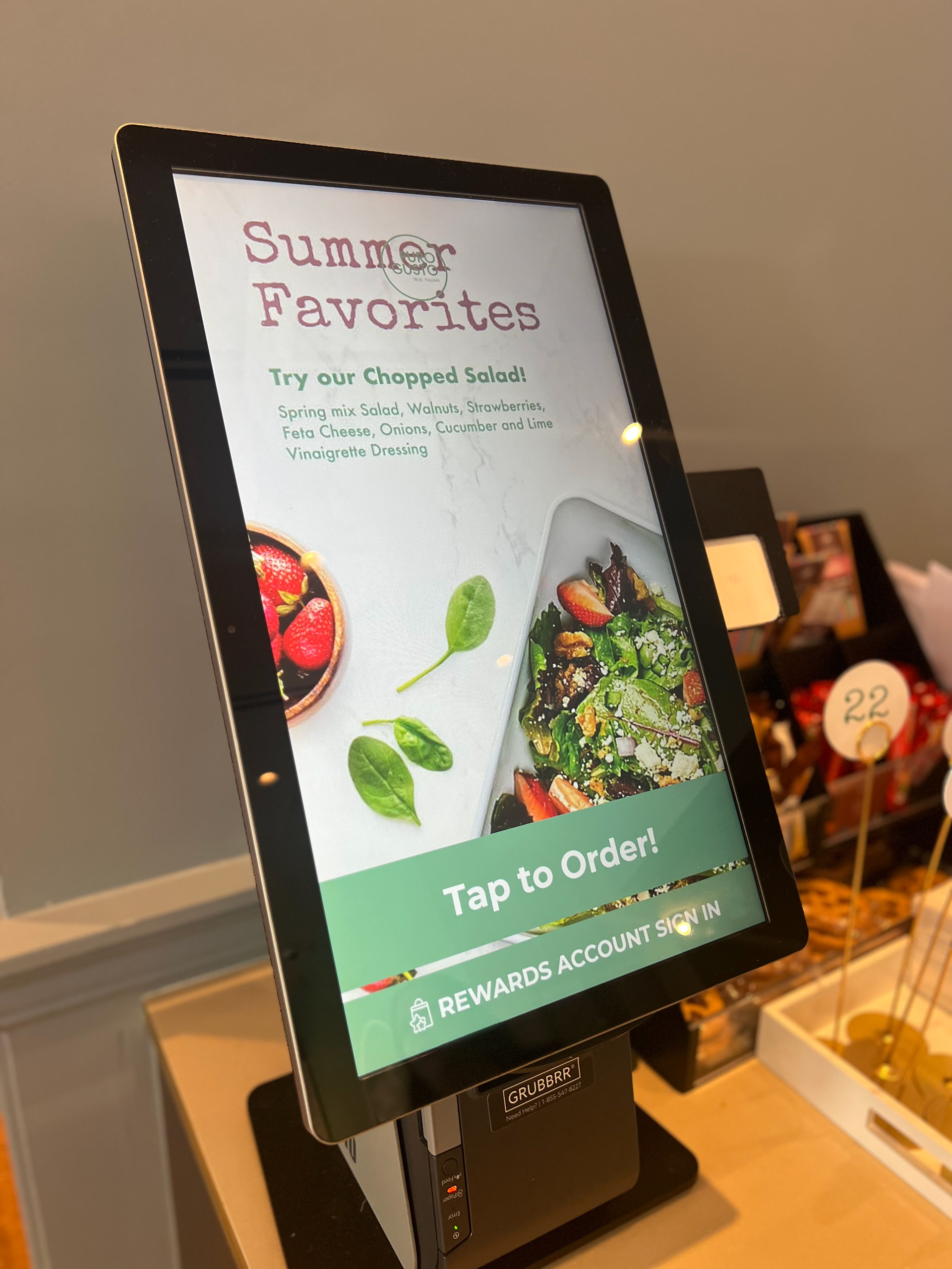
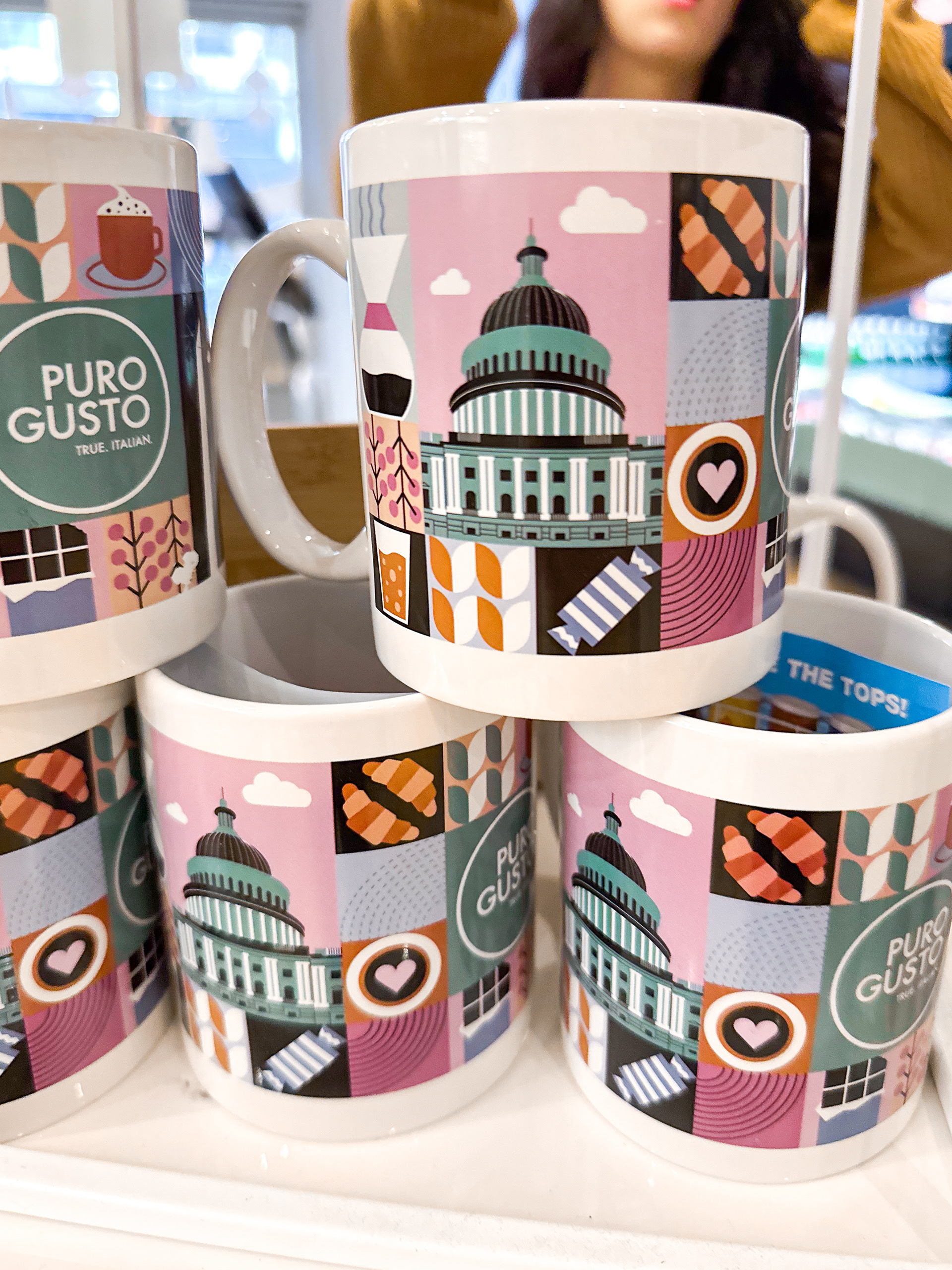
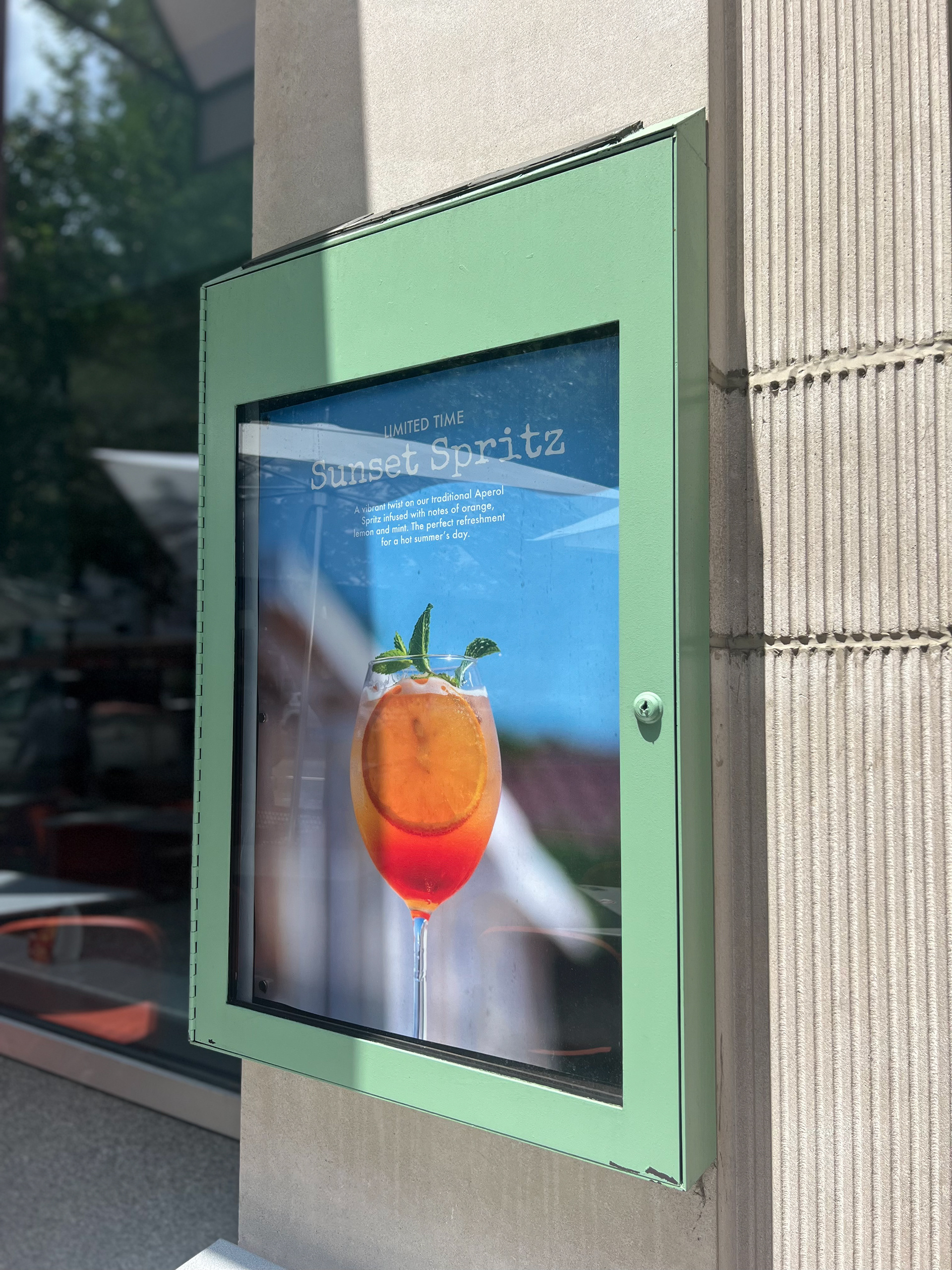
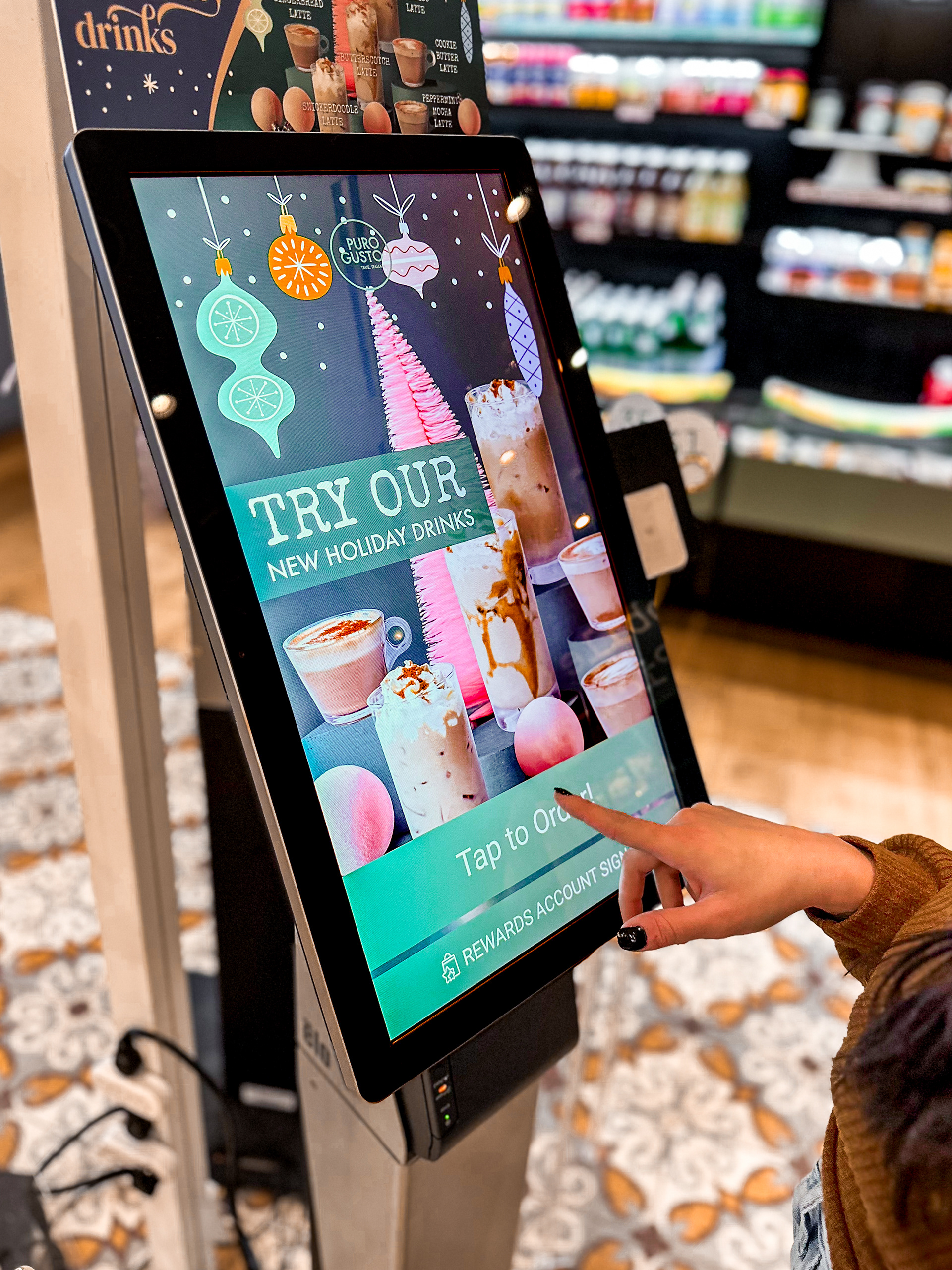
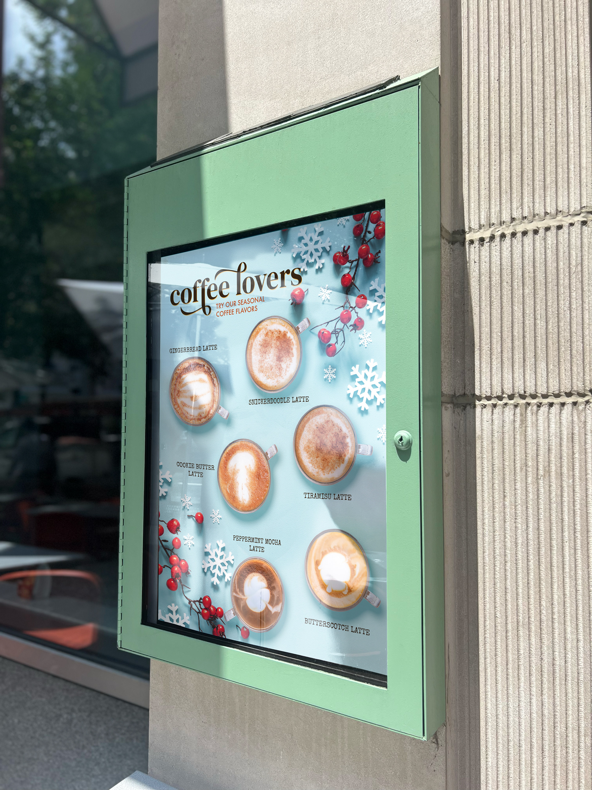
The Deliverables
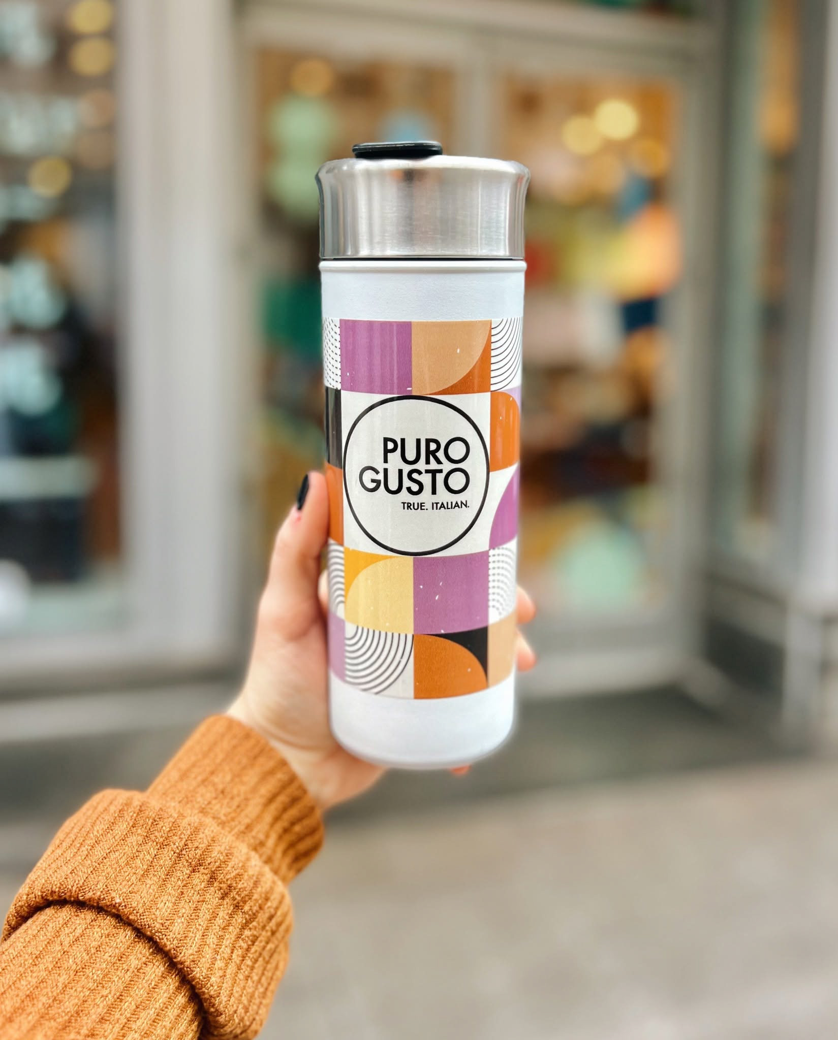
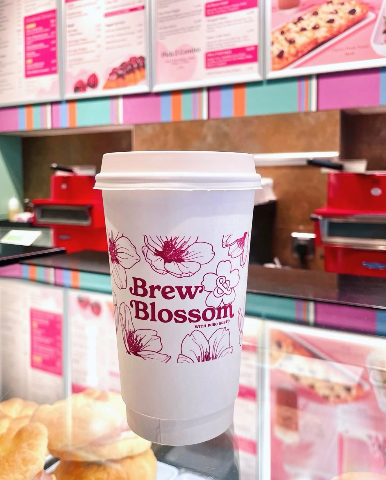
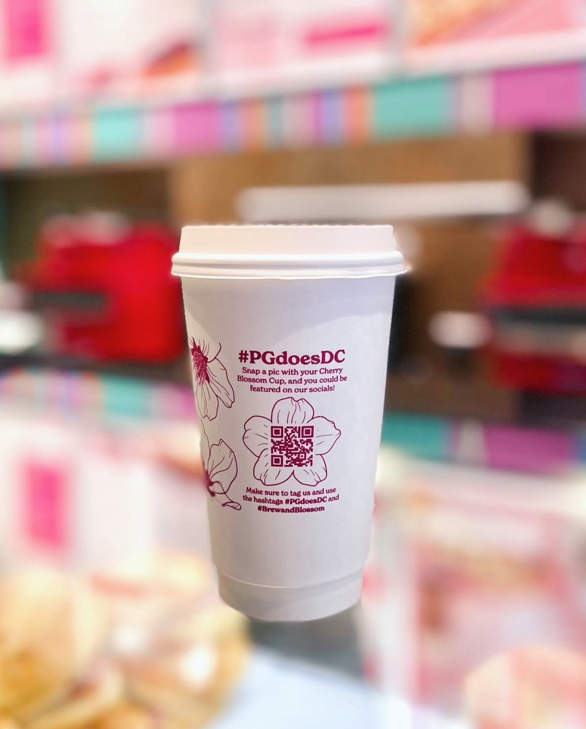
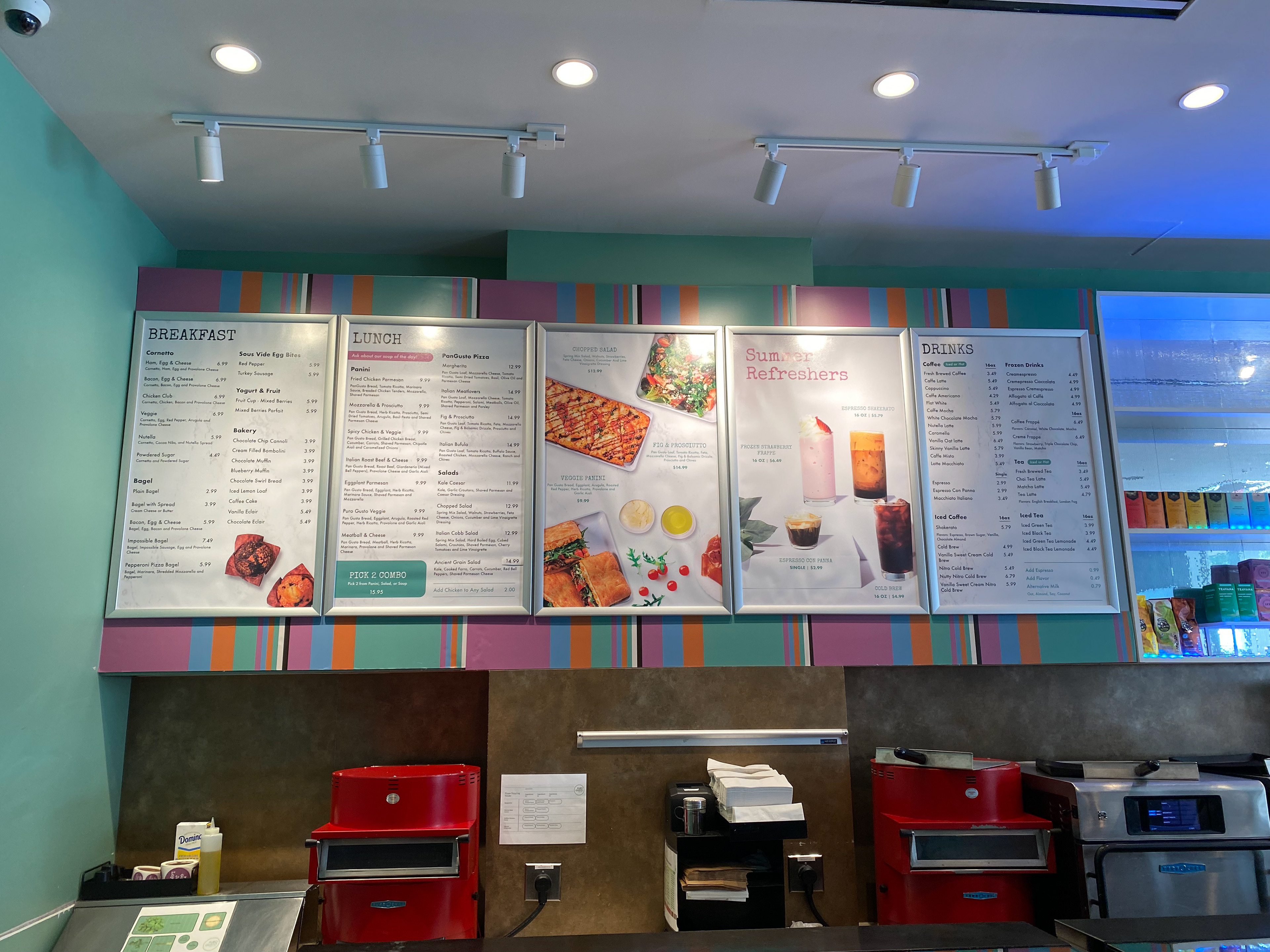
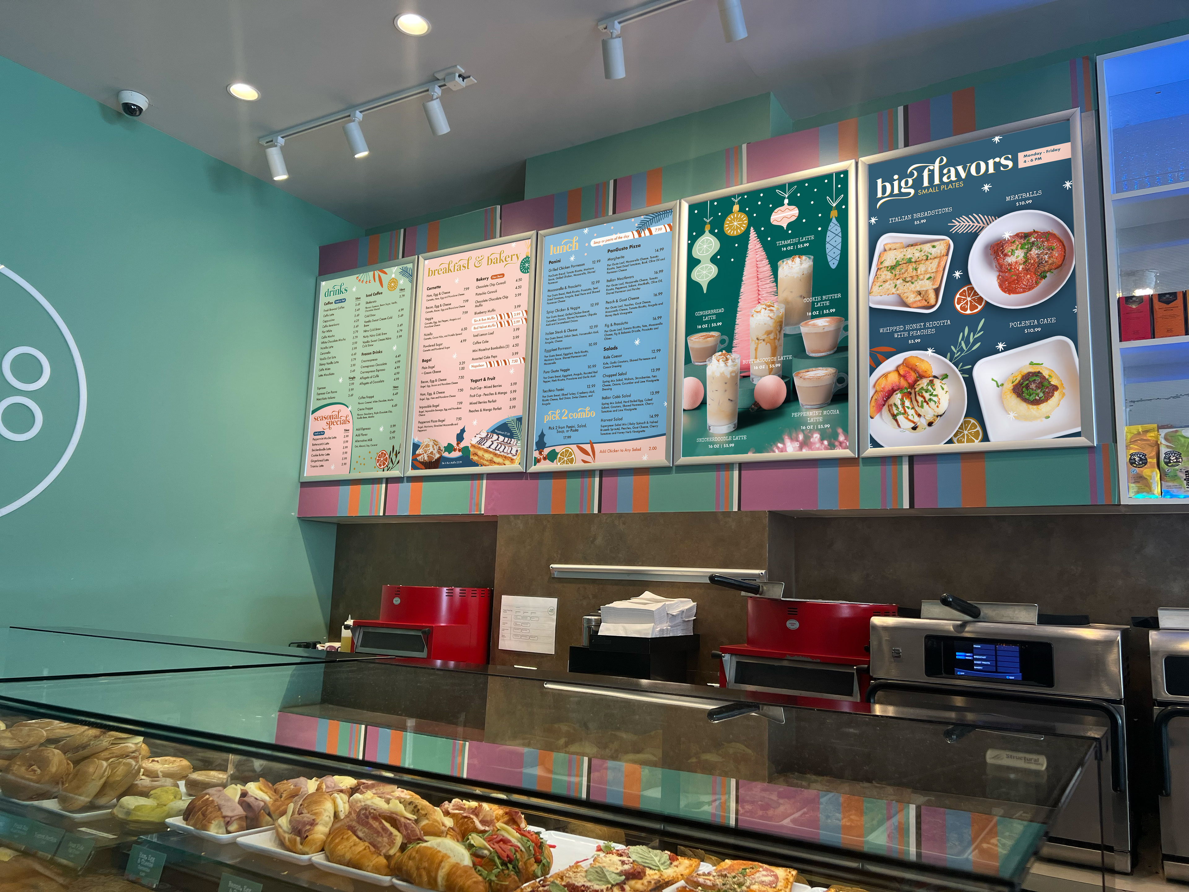
The design work for this campaign was executed across a comprehensive set of touchpoints, including in-store and exterior printed signage, seasonal menus, social media content, branded merchandise, and digital assets for the app and in-store ordering system. Below is an overview of the key designs developed for the campaign.

The campaign ended up being very successful resulting in the name and key design elements being carried over for the next holiday campaign in 2024.
Additional deliverables for subsequent campaigns