Client Overview:
McCutcheon’s Apple Products is a Frederick, Maryland based food producer best known for its homestyle fruit butters and preserves. Rooted in tradition and craftsmanship, the brand embodies a warm, family-oriented sensibility that resonates strongly with its audience. This authentic, heritage-driven brand has cultivated a deeply loyal and multigenerational customer base.
The Project:
When I began working with the brand, the company was in the middle of a leadership transition. The new president wanted to maintain the rustic, home-style character customers loved, while giving newer product lines a visual refresh. The challenge was finding the right balance by modernizing the packaging without losing the warmth and familiarity that defined the brand.
Over the next four years, I developed an updated label system that worked within the existing packaging structure, met evolving FDA requirements, and elevated the overall look. The solution resulted in a cohesive, polished farmhouse aesthetic that felt both authentic and refreshed, allowing the brand to grow while staying true to its roots.
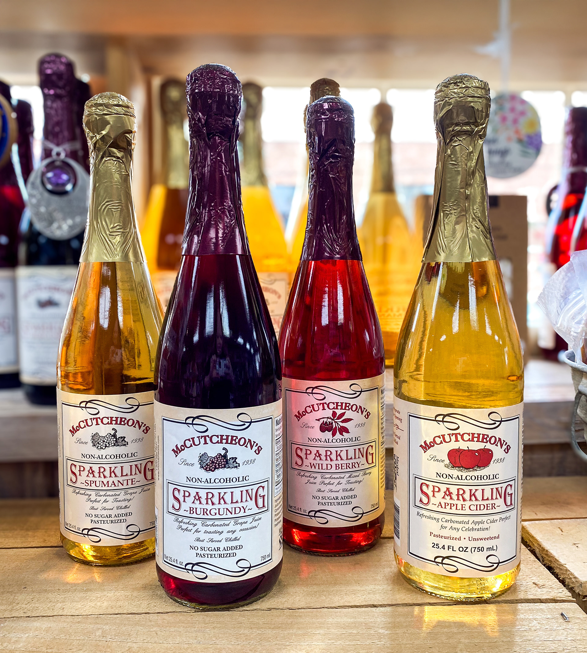
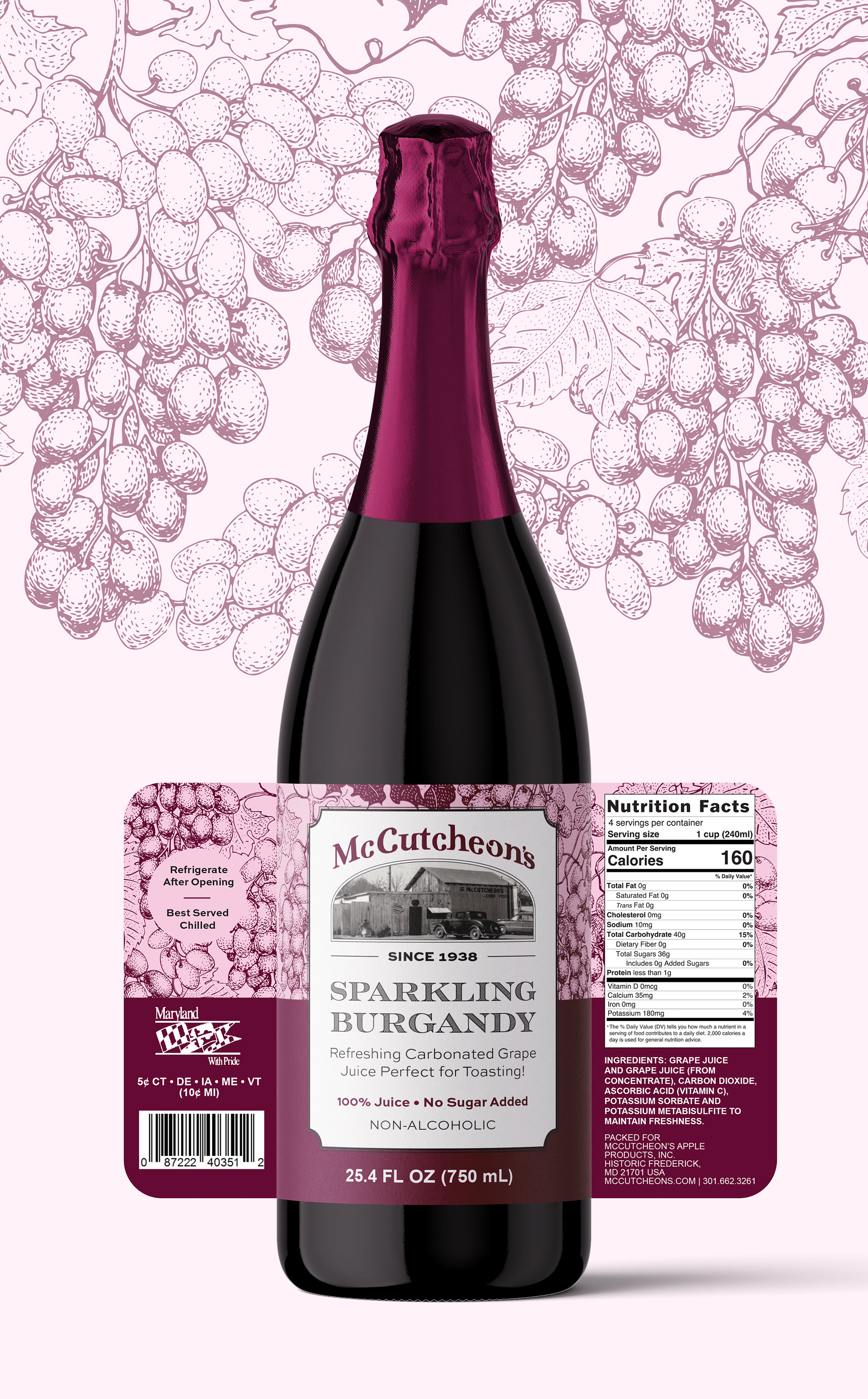
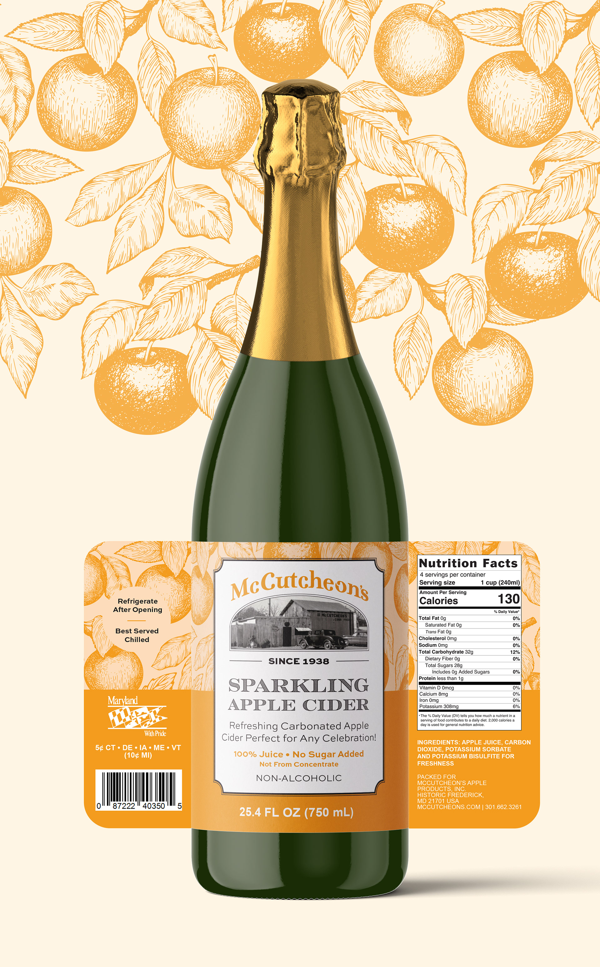
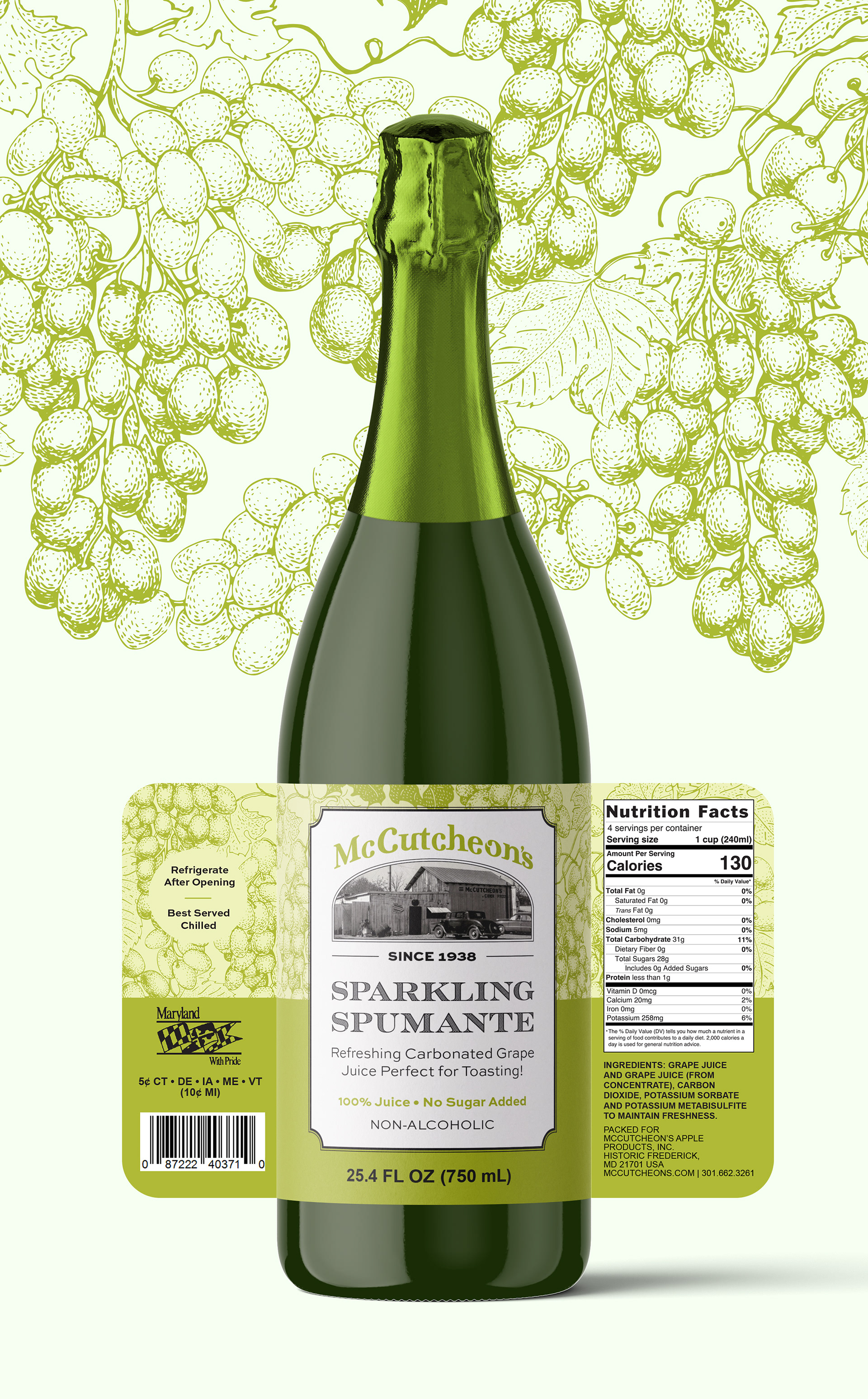
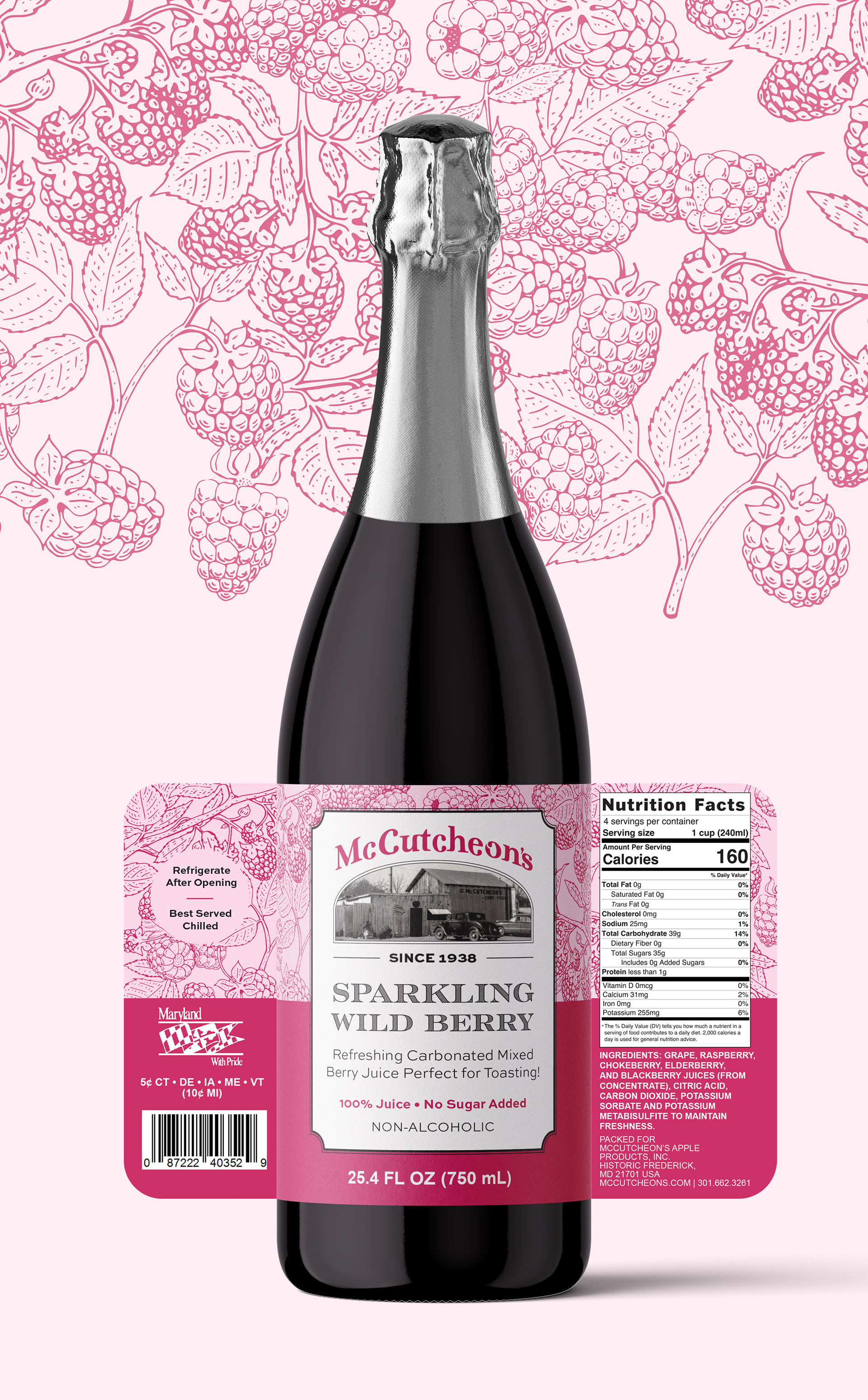
McCutcheon's Sparkling Ciders - Label Redesign
Bottles with the previous label design
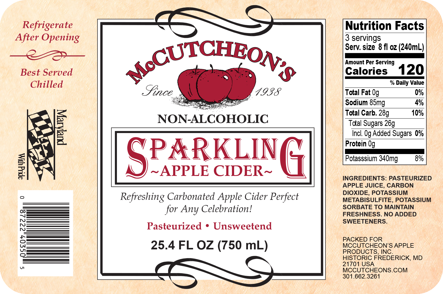
This project began with an evaluation of one of the original labels for McCutcheon’s Sparkling Apple Cider. Several elements of the existing design felt dated, including the typography, the aged paper background texture, the cartoon-style apple illustrations, and a legacy wordmark that is no longer in use. In addition to the visual updates, the label required layout changes, small-type adjustments, and a redesigned nutrition panel to ensure compliance with current FDA packaging standards.
McCutcheon’s positions its sparkling cider as a festive, family-friendly beverage for holidays and special occasions and is often enjoyed as a non-alcoholic alternative to wine. With this in mind, I approached the redesign from a more refined, elevated perspective, drawing inspiration from traditional wine label aesthetics. The updated design features etched fruit illustrations specific to each cider variety, layered subtly in the background, alongside a historical photograph of McCutcheon’s to reinforce the brand’s heritage and legacy.
Color plays an important role within McCutcheon’s broader product system, as each category and individual product is assigned a distinct hue tied to its ingredients. To strengthen brand consistency and improve shelf recognition, one of the primary strategic updates was implementing a clear, cohesive color-coding system for each flavor, making the varieties immediately distinguishable while maintaining a unified visual identity.
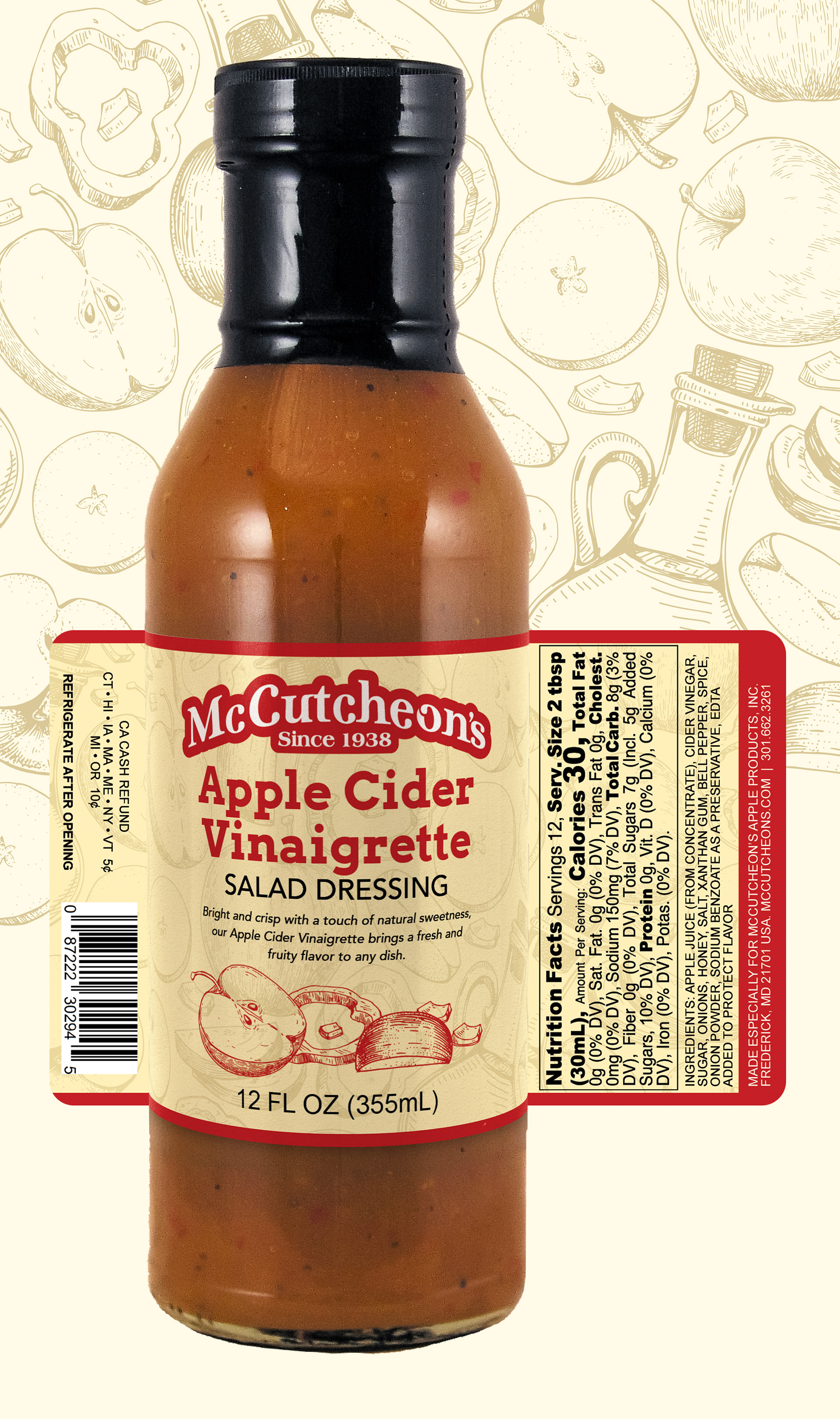
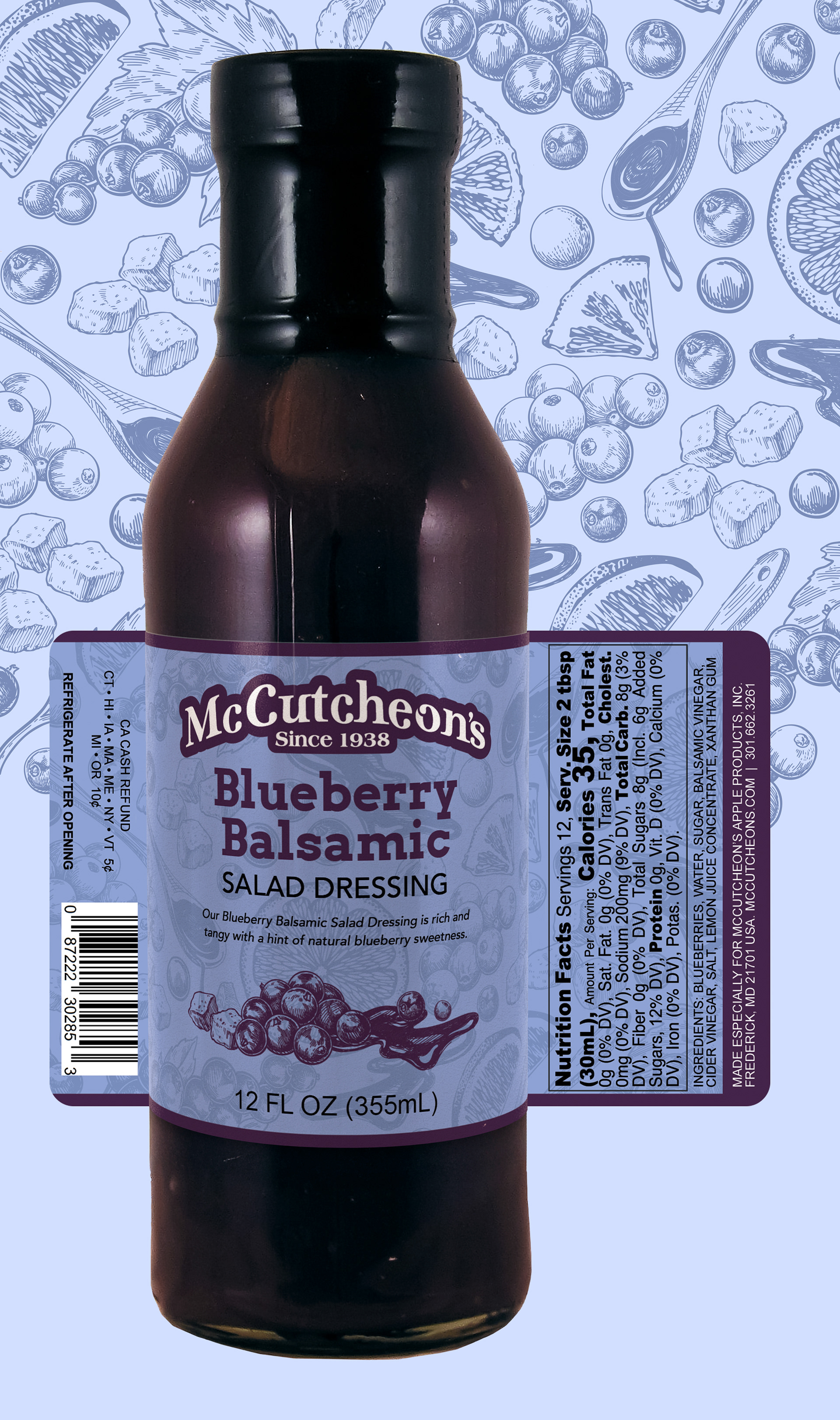
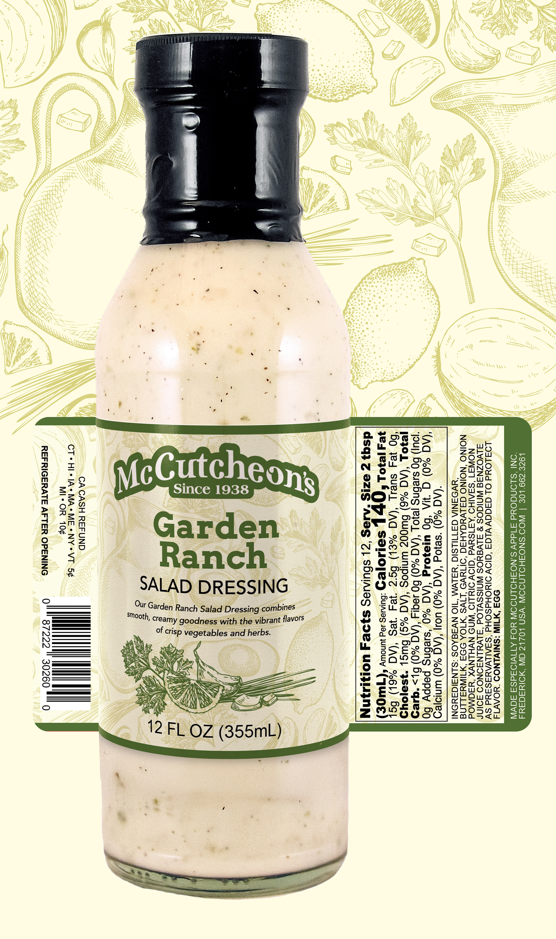
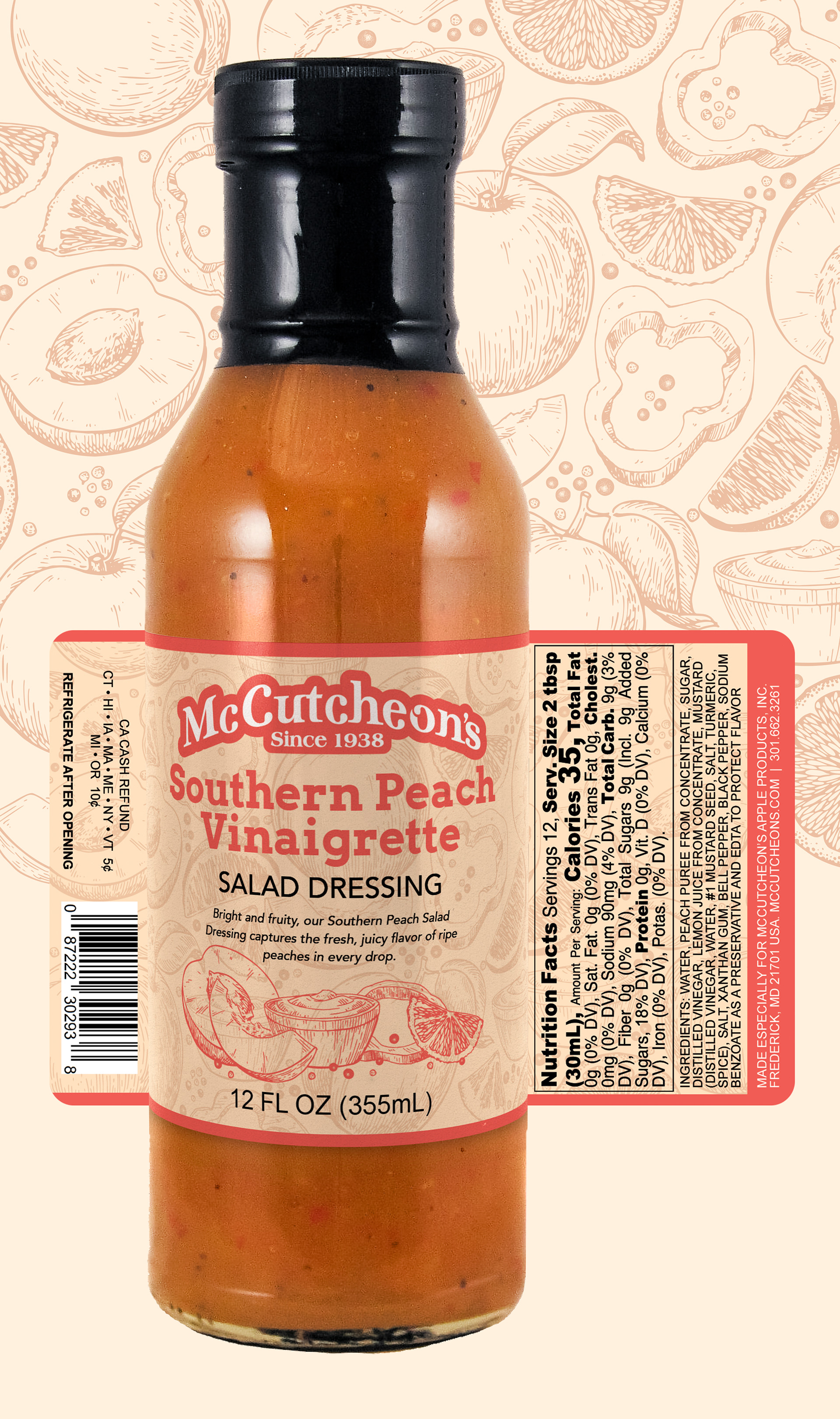
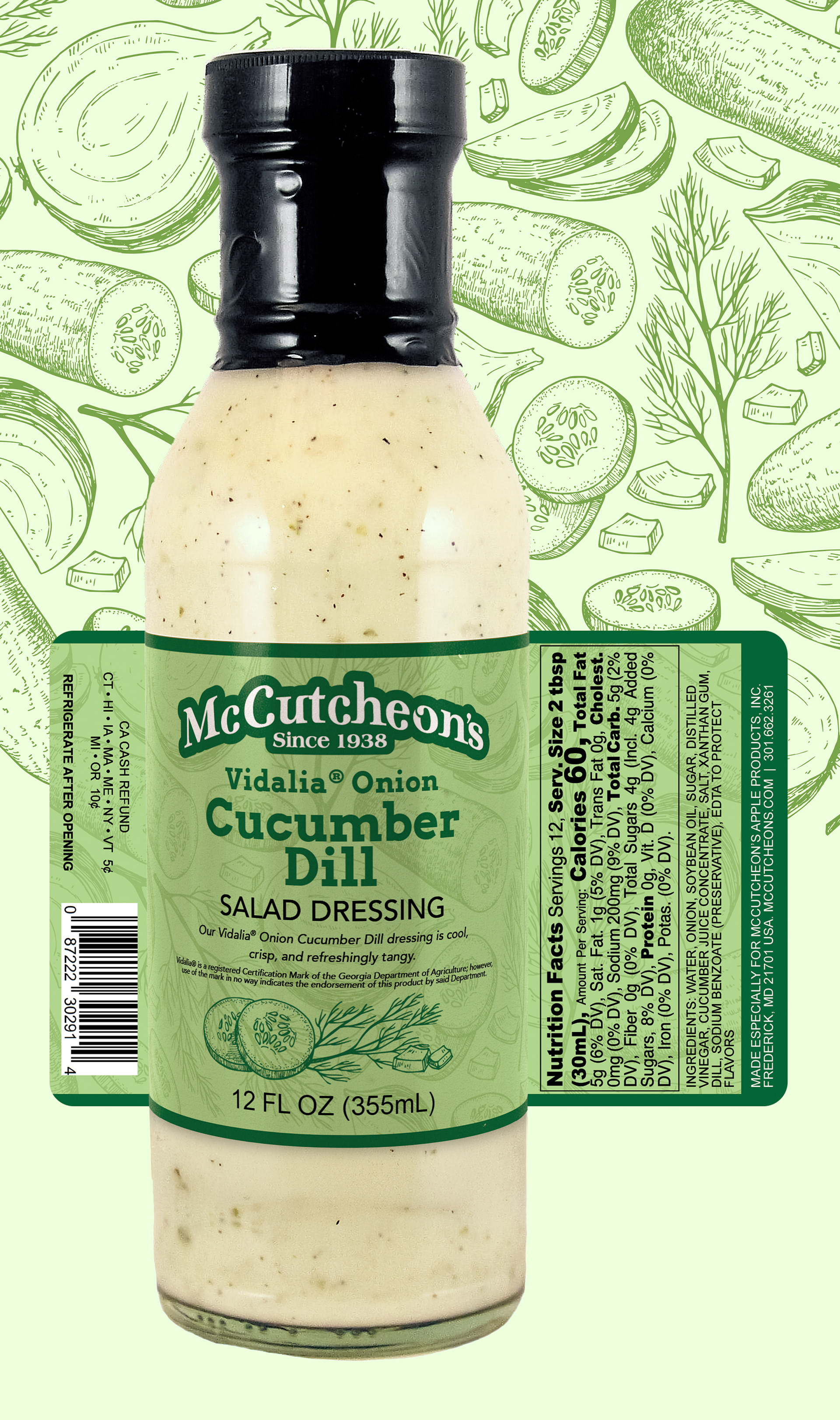
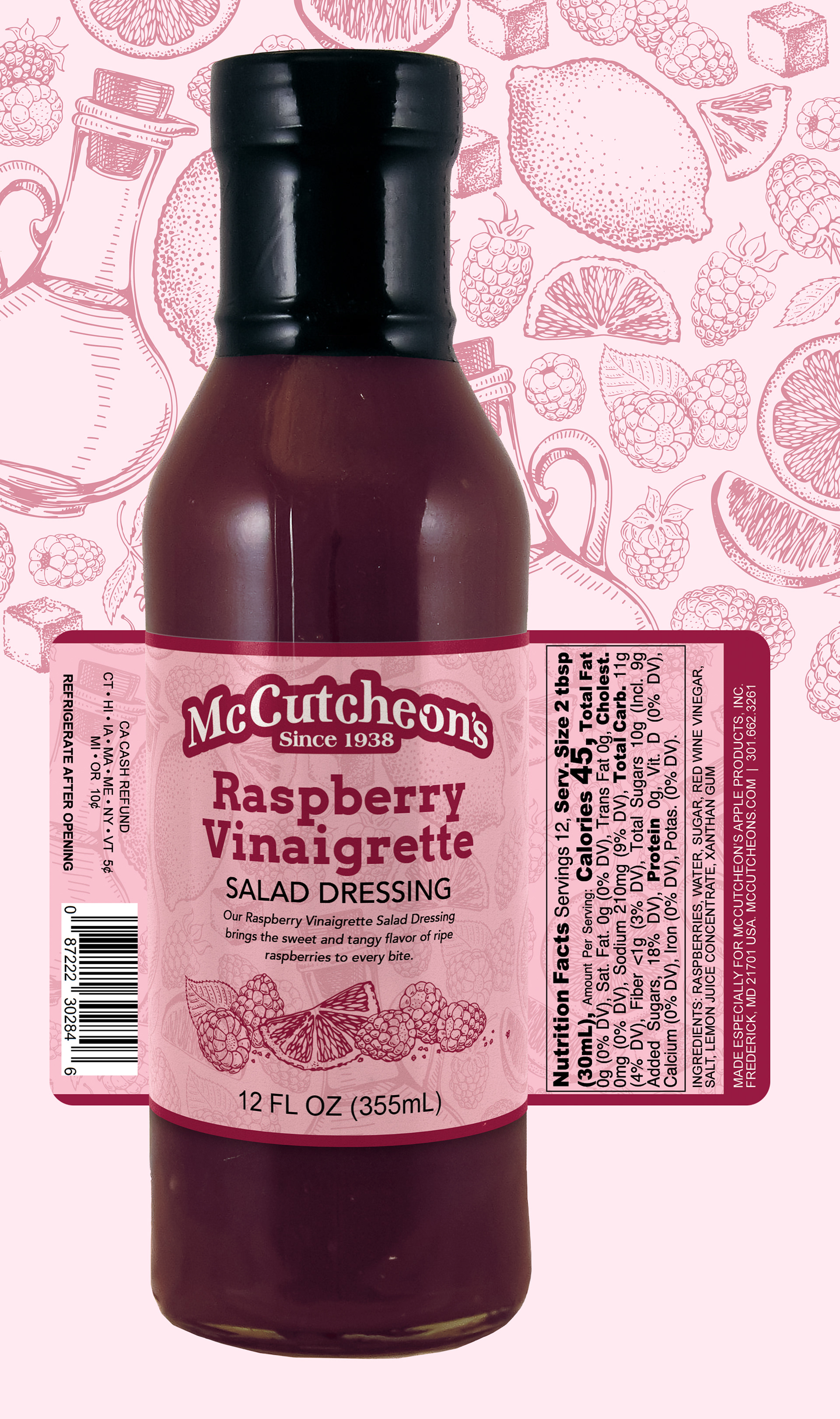
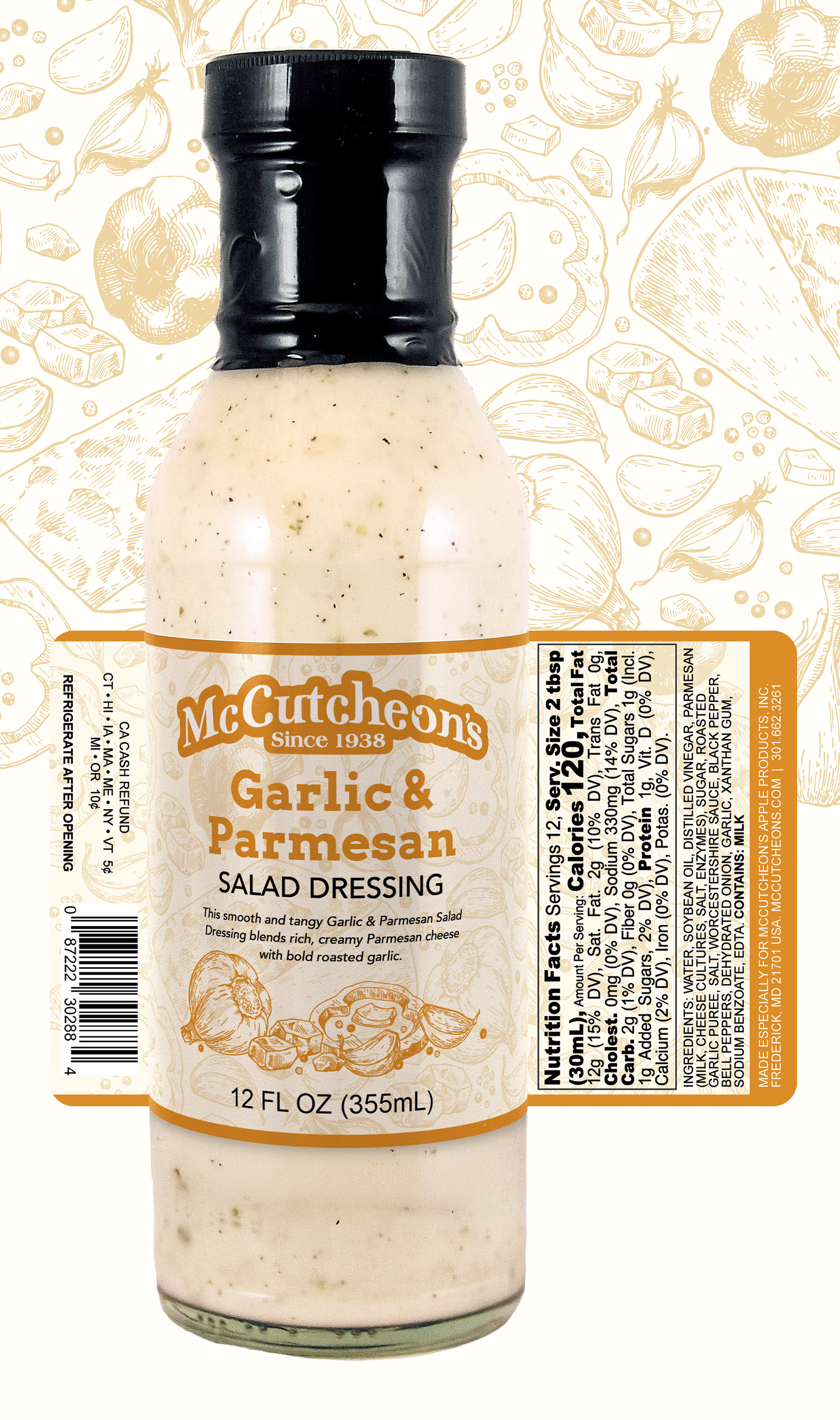
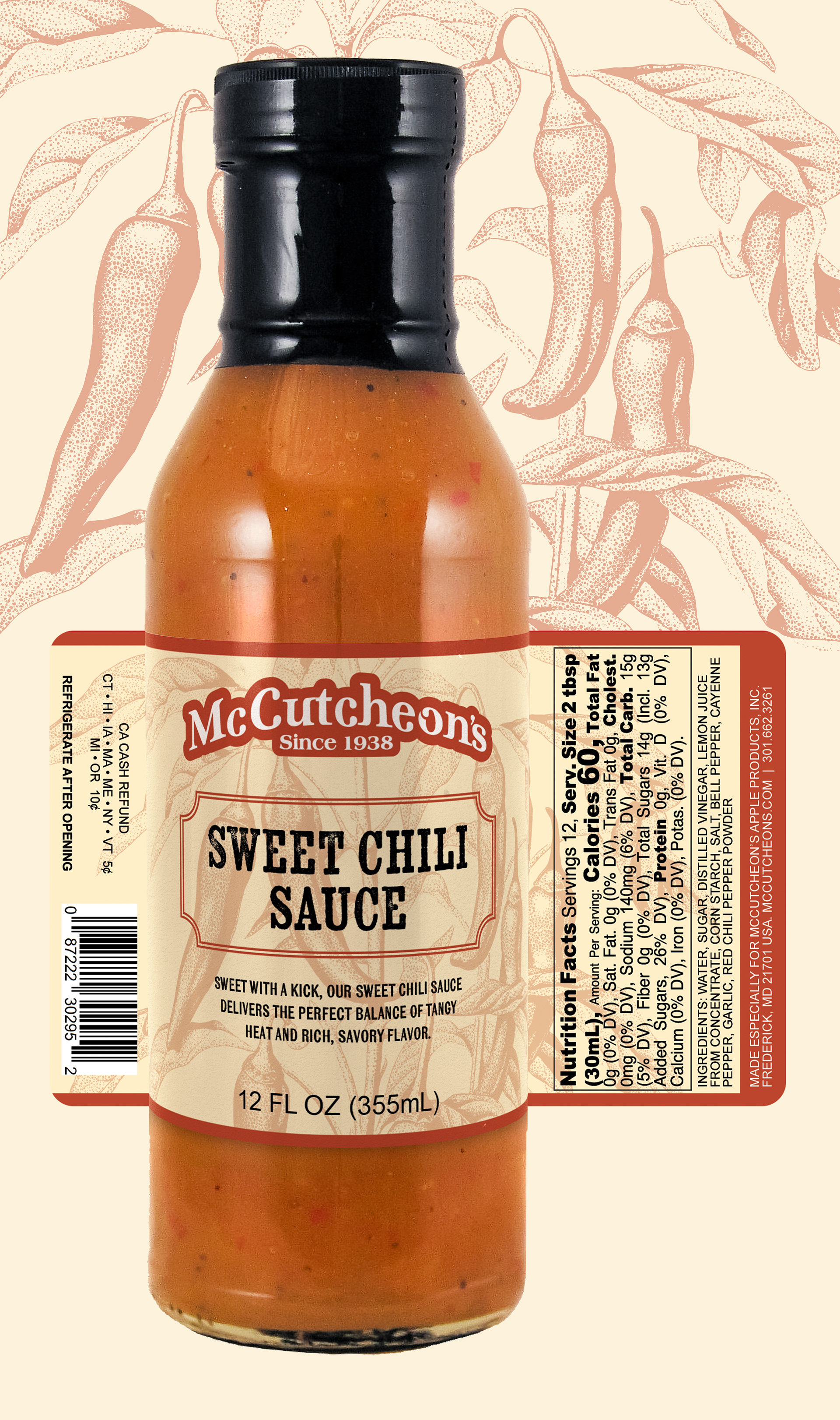
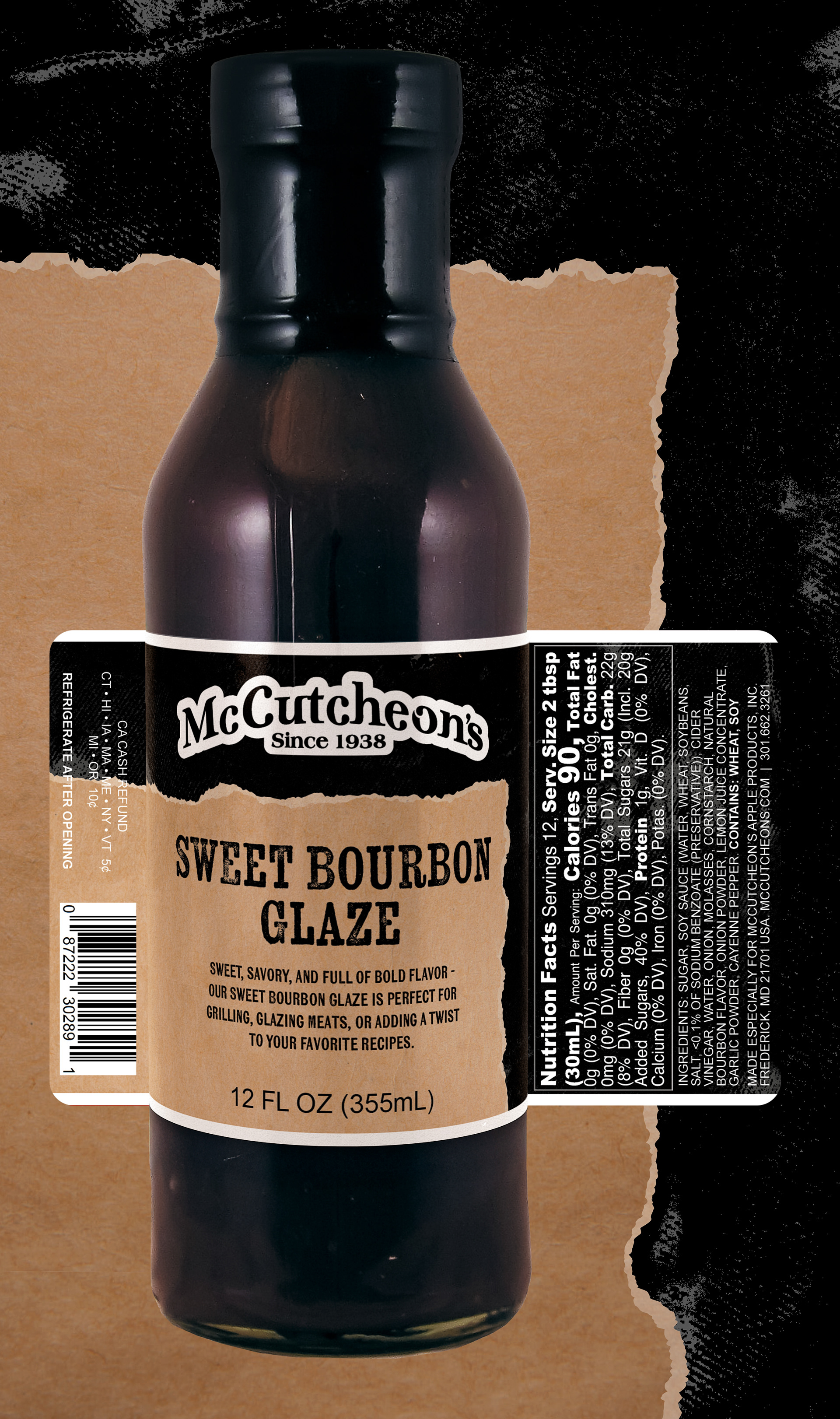
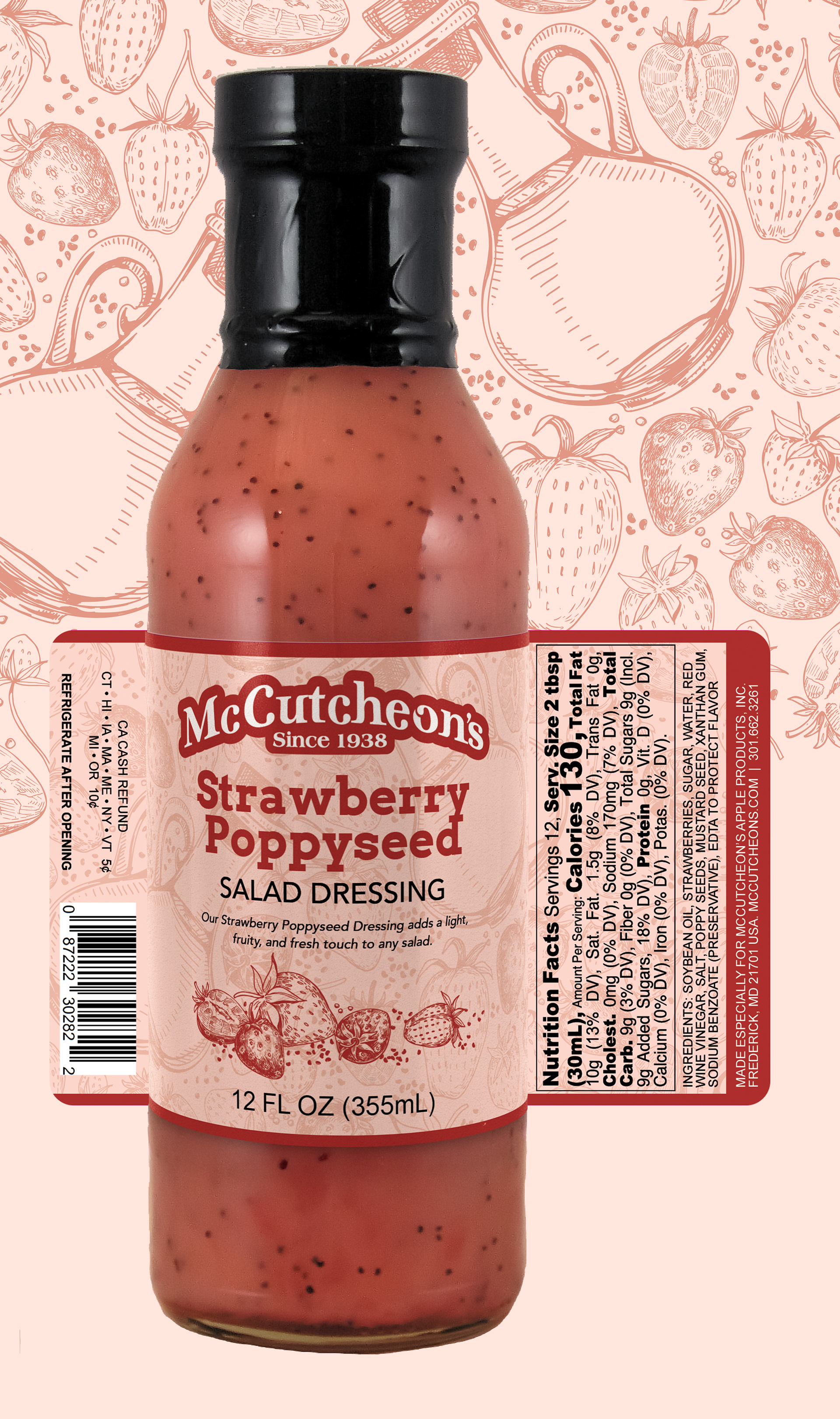
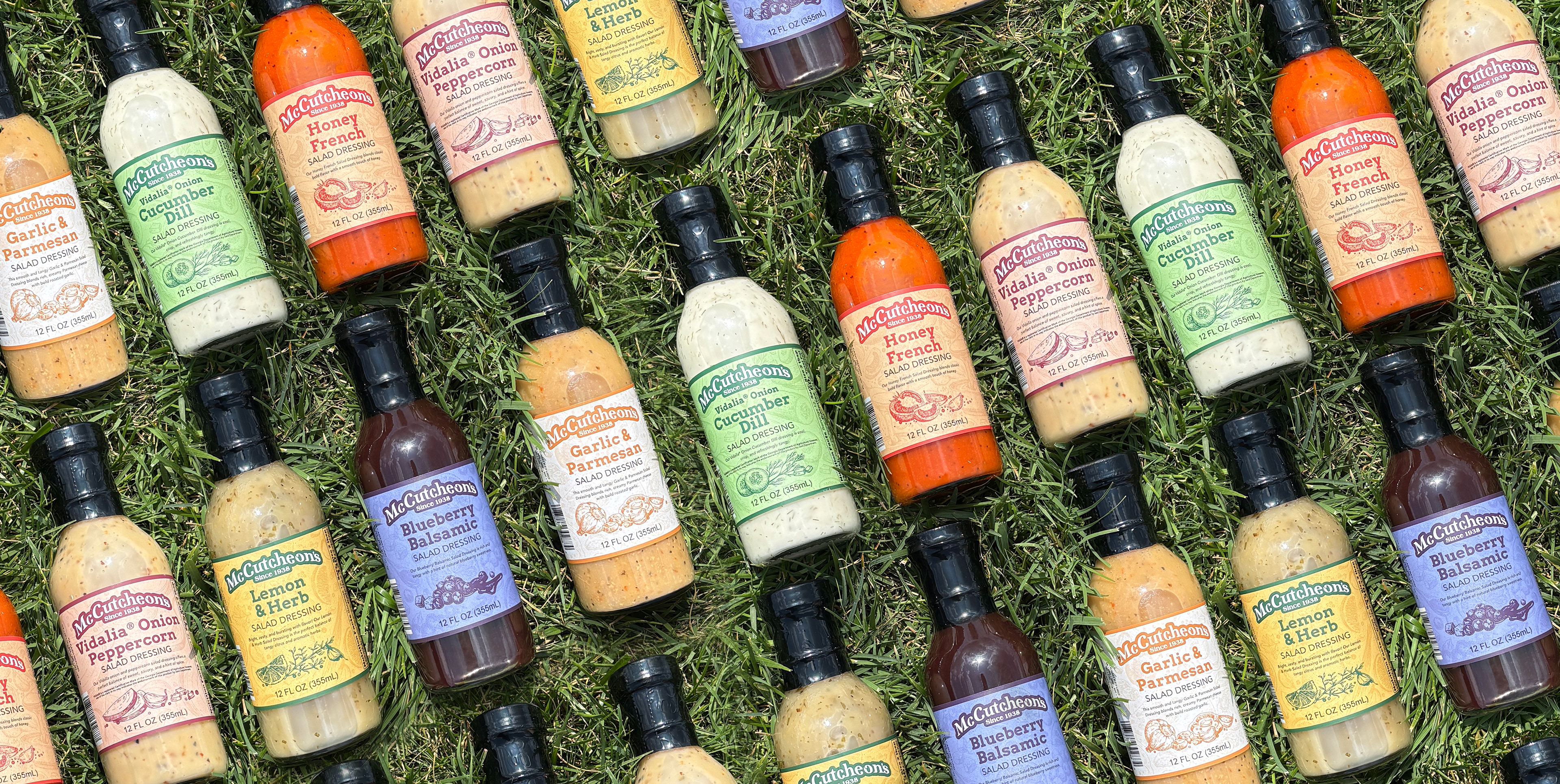
McCutcheon's Salad Dressings - New Flavors and Redesigned Labels
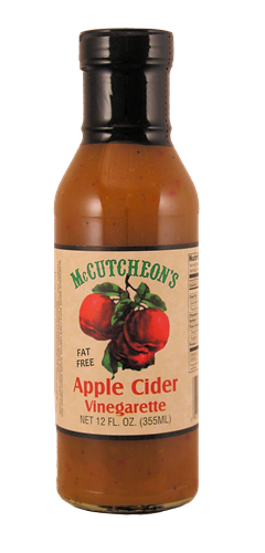
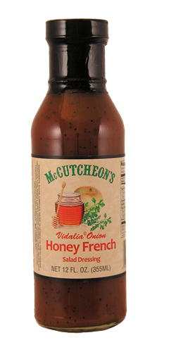
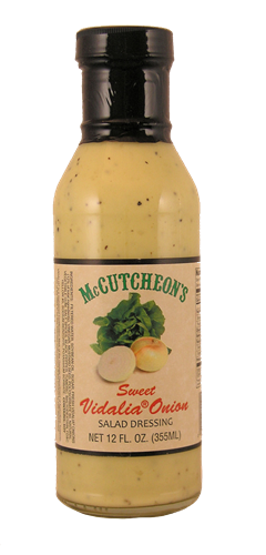
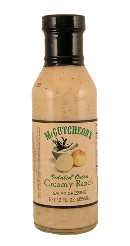
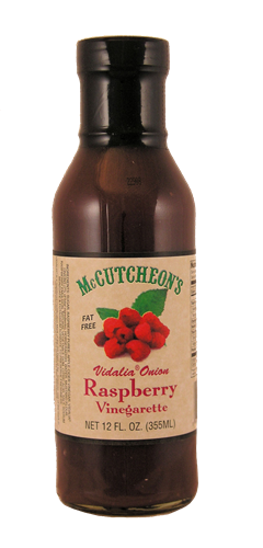
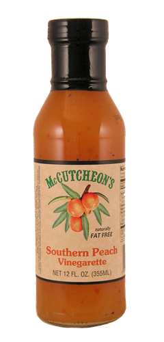
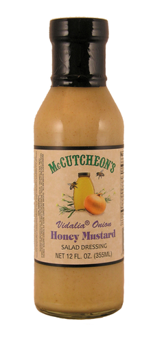
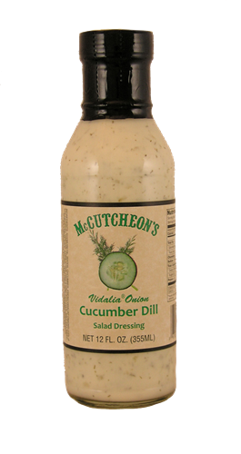
Some of the original dressings and their labels
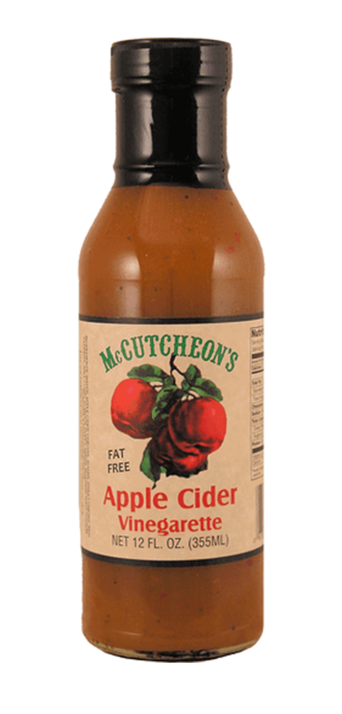
Similar to the sparkling cider line, McCutcheon’s salad dressings were due for a comprehensive visual refresh. The original labels relied on an aged paper background and dated ingredient graphics, which no longer aligned with the brand’s evolving identity. At the same time, the product lineup itself was expanding, retaining several core flavors while introducing new dressings and sauces, requiring a more flexible and scalable design system.
Building on the established brand approach, each dressing was assigned a distinct color tied to its flavor profile, creating consistency across the product range. The redesigned labels feature a layered collage of illustrated ingredients in the background, complemented by a smaller, more focused ingredient callout near the product name to improve clarity and quick recognition on shelf.
Two new additions, the Sweet Chili Sauce and Sweet Bourbon Glaze, required a departure from the traditional salad dressing visual language. To differentiate these products both from the core lineup and from each other, I developed more individualized design treatments that reflect their unique flavor profiles. The Sweet Bourbon Glaze incorporates a richer, barbecue-inspired aesthetic, while the Sweet Chili Sauce features bold chili pepper imagery and a more vibrant composition, signaling a distinct use case while maintaining cohesion within the broader brand system.